
CONTEXT
8 week project during a bootcamp to design a conceptual mobile app by identifying and exploring a human-centered problem suitable for digital intervention.
MY ROLE
Interaction and Experience Design, Project Management, Research, Copywriting
TOOLS
Figma
Photoshop
Illustrator
Premiere
METHODOLOGY
I used the Double Diamond process to guide my work, focusing on discovery, definition, development, and delivery, to ensure a user-centered approach.
AT A GLANCE
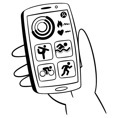
As a UX researcher and designer, my task was to identify and explore a human-centered problem suitable for digital intervention. I chose to focus on the intersection of the menstrual cycle and athletic performance in women. This exploration led to the creation of Align, a conceptual app designed to bridge this gap.
My objective was to understand the nuanced challenges active women face and develop an app that not only respects but also leverages the intricate relationship between menstrual health and physical well-being.
THE PROBLEM
In the realm of fitness, there's often a push for peak performance mentality that overlooks a crucial biological factor influencing women's physical and mental well-being: the menstrual cycle.
This cycle orchestrates a symphony of hormonal fluctuations, impacting cardiovascular, respiratory, metabolic functions, and exercise physiology, thereby shaping a woman's exercise capacity, substrate utilization, and physiological responses. During certain phases, some women may experience a decrease in performance, heightened fatigue, or other symptoms.

Yet, the prevailing fitness culture often espouses a doctrine of uniformity and high intensity, urging women to 'suck it up' and adhere to rigorous training schedules, irrespective of their menstrual cycle.
This expectation to consistently perform at one's peak, despite the body's natural ebb and flow, underscores a pervasive yet overlooked challenge in women's fitness: the need for a nuanced approach that harmonizes fitness with the menstrual cycle.
SECONDARY RESEARCH
Through comprehensive user research, including secondary research and discussions with a diverse group of women—from fitness novices to seasoned athletes—I gained valuable insights into the desires and frustrations surrounding women's health and fitness.
71%
of active women report feeling that their training is compromised during specific phases of the menstrual cycle
62%
of female athletes do not feel comfortable discussing menstrual cycles with coaches
20%
of women adjust their training based on their menstrual cycle phases
HYPOTHESIS
I formulated a hypothesis statement that framed the problem and potential solutions, which served as a guiding framework for conducting user interviews and validating assumptions.
I believe that athletic women encounter significant difficulties in understanding how different phases of the menstrual cycle affect their training, which leads to reduced efficiency in training and safety, ultimately hindering their ability to meet their fitness goals.
I will know I'm right when I see that at least 75% of my user interview respondents explicitly state they face a lack of clear, actionable guidance on adapting their training to their menstrual cycle.
PRIMARY RESEARCH
To validate this hypothesis, I planned to conduct in-depth interviews with 4 active women with varying levels of fitness activity to understand the problem through their experiences. The intention was to qualitative insights into their experiences, challenges, and needs, and use these insights to identify common pain points, motivations, and behaviours.
pARTICIPANT criteria
18 - 45 years old
Female (experience a menstrual cycle)
Active, which can include athletes, weight-lifters, runners, or people who practice other forms of fitness as a part of their lifestyle
INTERVIEW INSIGHTS
Through these interviews, it became evident that women are keenly aware of the intersection between their menstrual cycles and fitness routines, yet they face significant challenges in navigating this space.Their experiences reveal a palpable gap in both knowledge and communication, underscoring a broader societal need to prioritize and empathize with women's unique physiological experiences.


Based on these insights, I started focusing on what to do next. This meant figuring out exactly what problem needed solving. It was like putting together a puzzle – finding out what pieces were most important and how they fit together to make something useful. This process helped me decide what the app should do and how it could really help active women in a meaningful way.
With my research in mind, I asked myself: How might we help athletic women to better understand how their menstrual cycle impacts their physical training so that they can improve performance at different stages of the cycle and meet their goals?
Reflecting on my interviews, I crafted a persona named that was an amalgamation of the women I spoke with. Sierra represented the core challenges and aspirations of my target audience, providing a focused lens through which I could view my design decisions.


With Sierra in mind, I mapped out her journey, pinpointing moments of frustration, need, and opportunity. This map guided me to specific points where the app could make a meaningful difference in her fitness routine.


Drawing from the identified opportunities, I crafted user stories that encapsulated the desired outcomes for Sierra and similar users. These stories were grouped into epics, each representing a major area of functionality within the app.

Epic 1: Personalized Monitoring and Adaption

Epic 2: Education and Awareness

Epic 3: Community and Motivational Support
Personalized Monitoring and Adaptation was my focus moving forward. The rationale for choosing this epic is rooted in the critical need for a tool that allows active women like Sierra to adapt their fitness regimes to their body's natural rhythms.
TASK SELECTION
My primary task was chosen because it would bring the most value to Sierra, ensuring that my design efforts would be focused and impactful. It also helped me with choosing specific features to develop based on their relevance to the user stories and their feasibility within the project's scope. Thinking from the perspective of Sierra, as I an active woman…
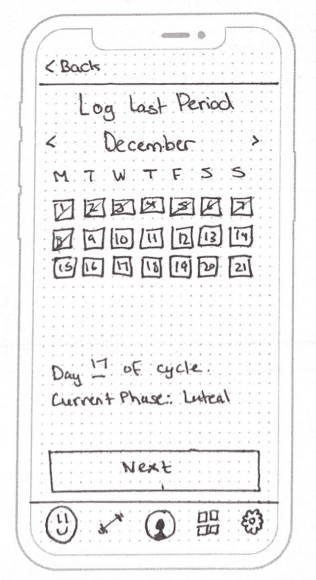
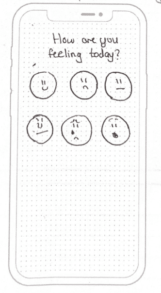
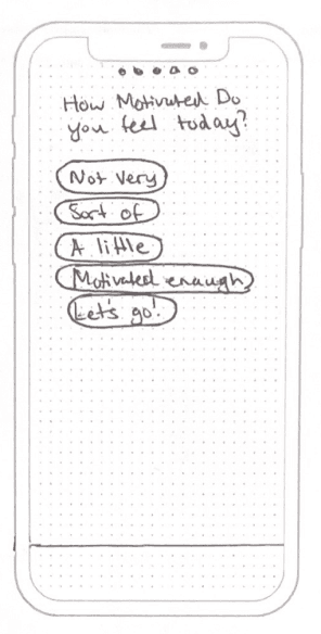
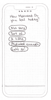
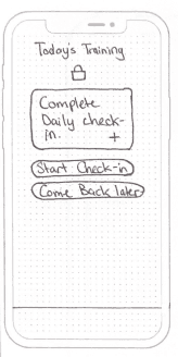
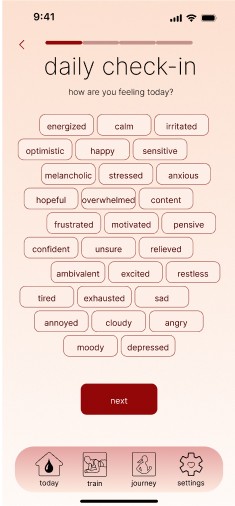
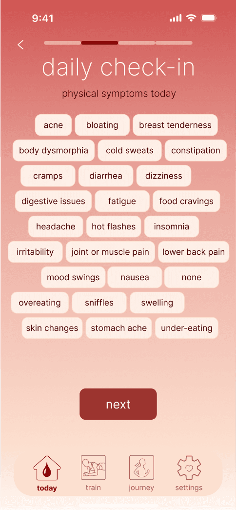
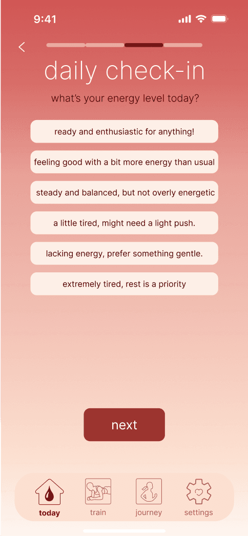
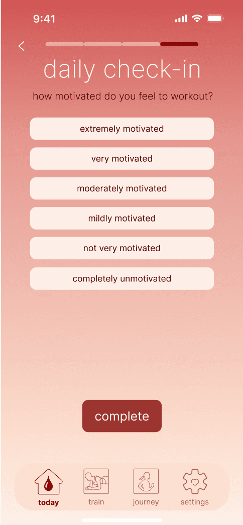
Thinking from the perspective of Sierra, as I an active woman, I want to record my emotional state and energy levels throughout my cycle so that I can correlate them with my training effectiveness.
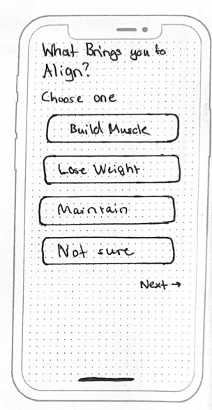
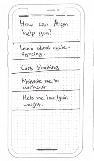
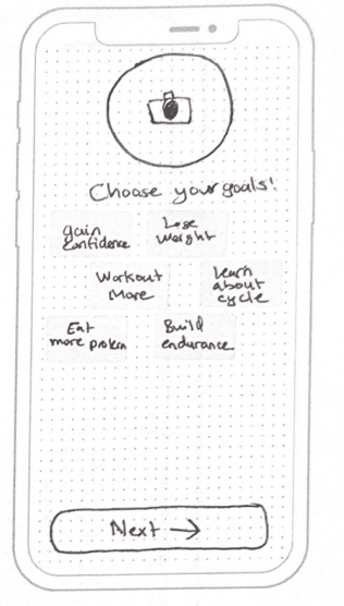
From here, I began exploring what Sierra's journey would look like using the app. I broke the task down into 5 simple steps:


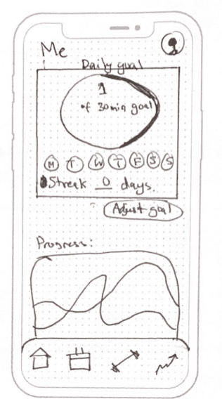
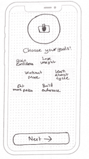
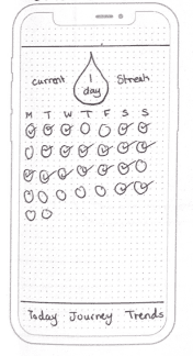
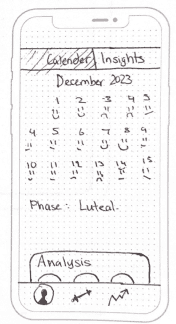
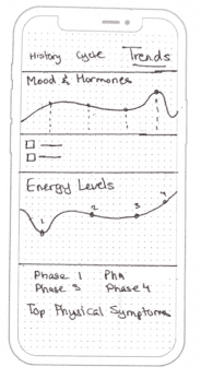
My desk became a canvas of possibilities, as I laid down a flurry of sketches of different screens within the app. These rough drawings were the first visual expression of the app's potential features and interfaces.


REFINING THE VISION
After sketching and exploring different layouts and features, I refined my ideas into solution sketches. These sketches laid the groundwork for Align, focusing on usability and how each feature meets my persona’s needs
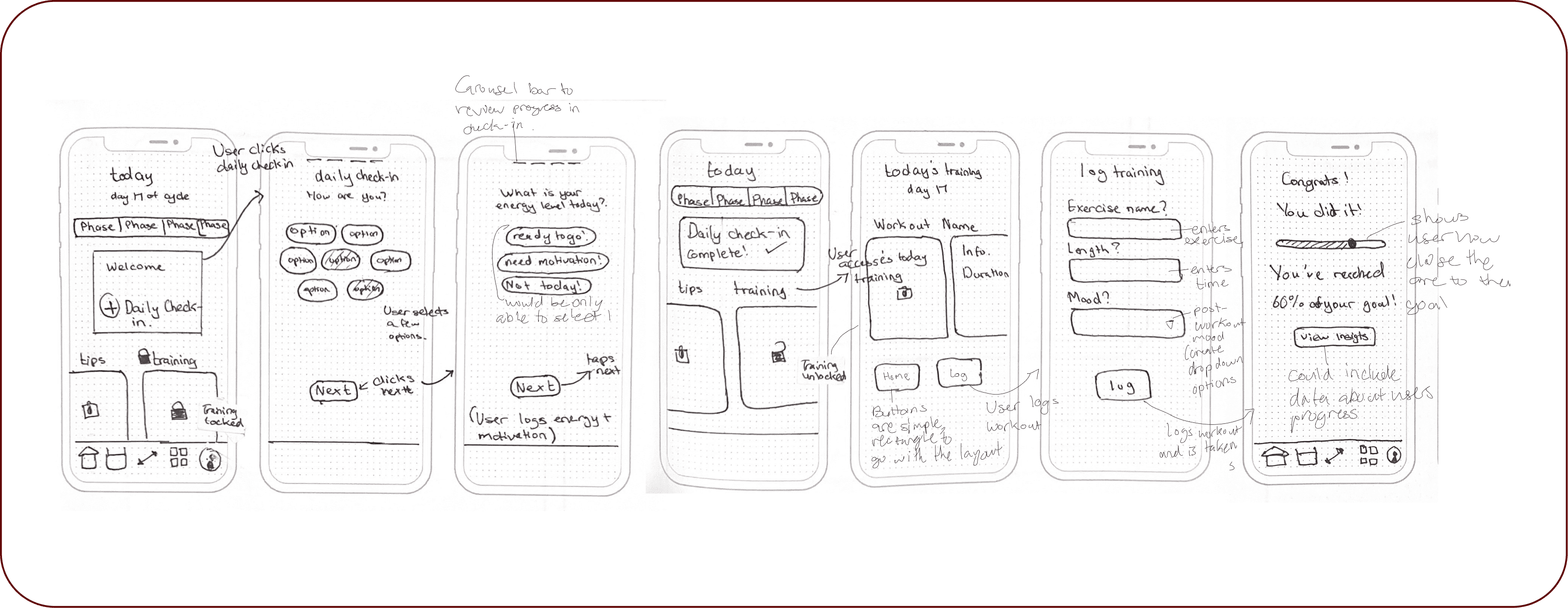
BRINGING IDEAS TO LIFE
These solution sketches evolved into mid-fi frames, giving me a clearer vision of how users like Sierra might interact with the app. This stage was critical, as it bridged the gap between abstract concepts and a functional prototype.


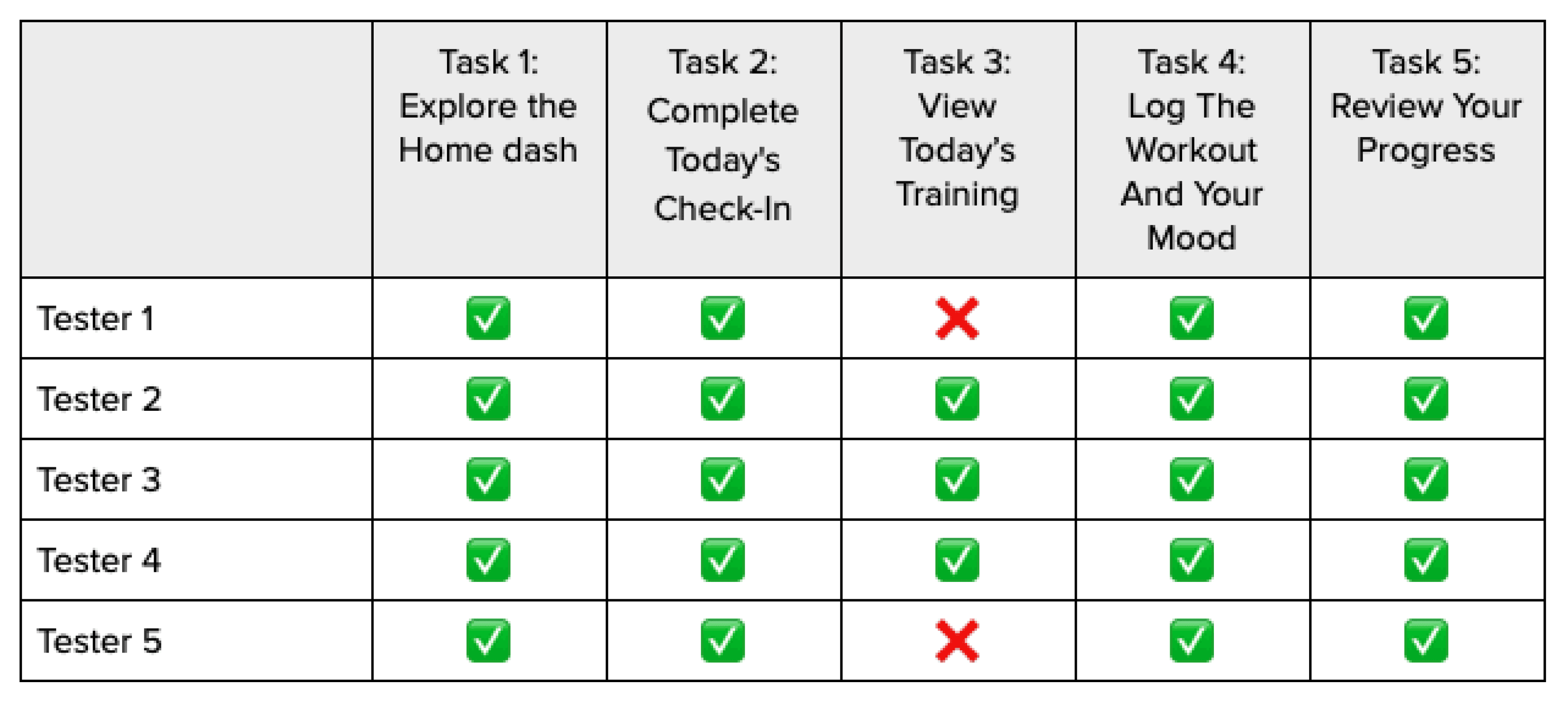
With a mid-fi prototype, I conducted 2 rounds of usability tests to see how real users would navigate the app.
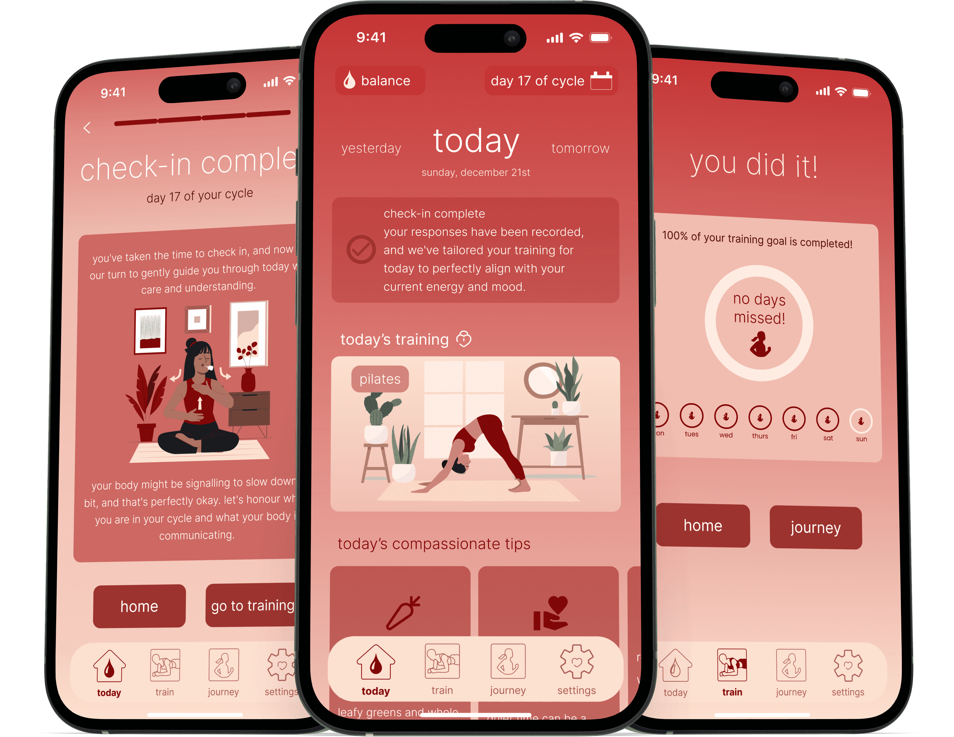
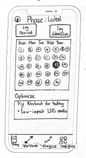
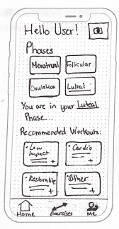
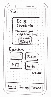
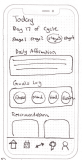
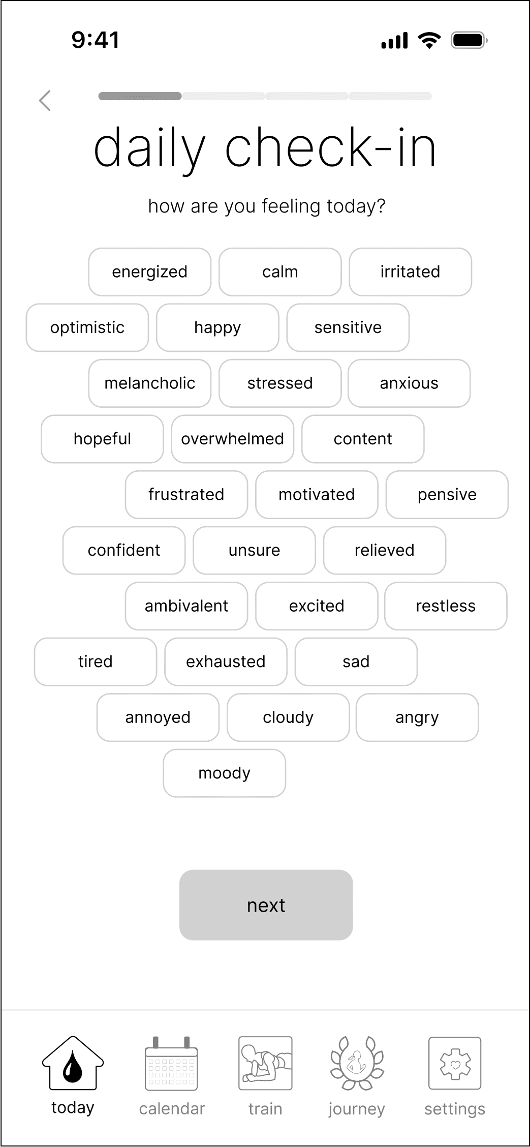
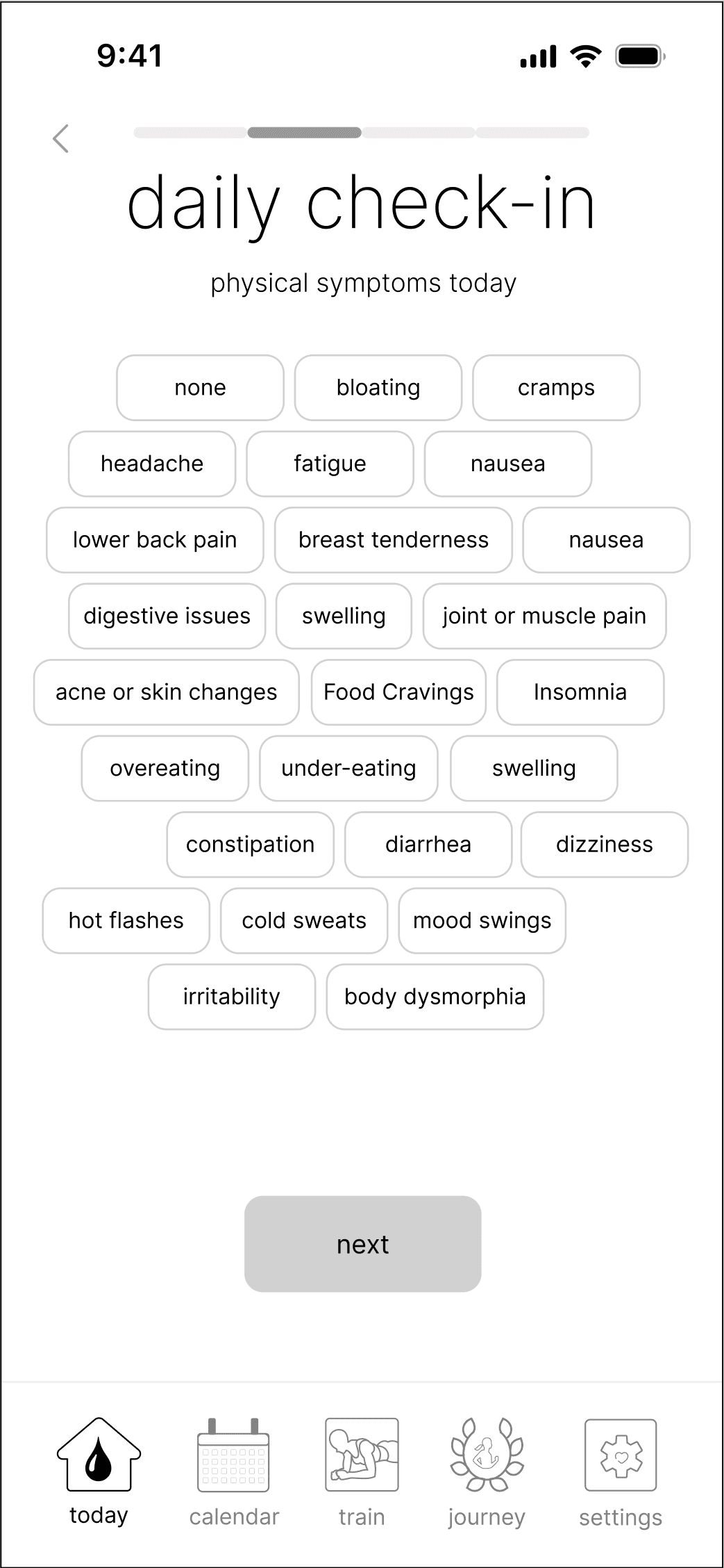
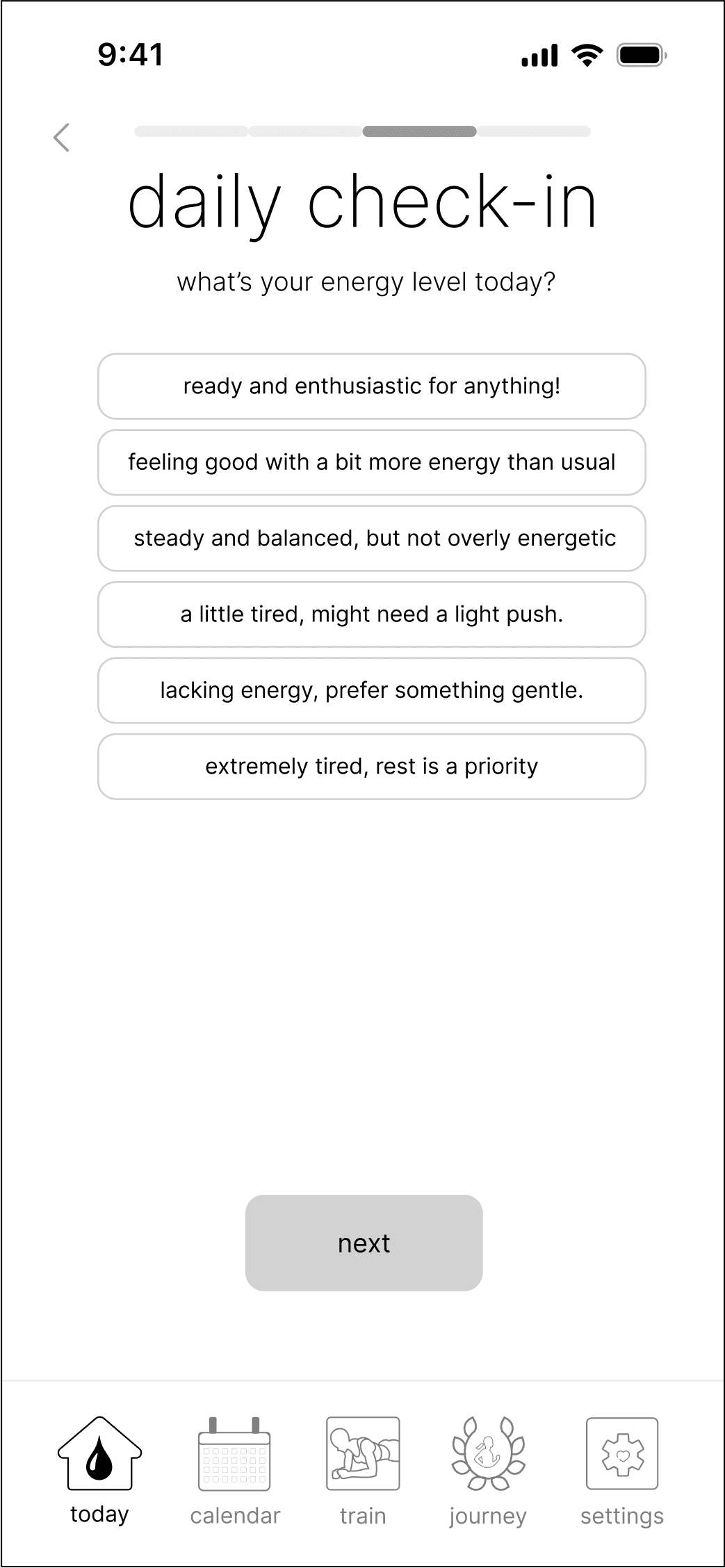
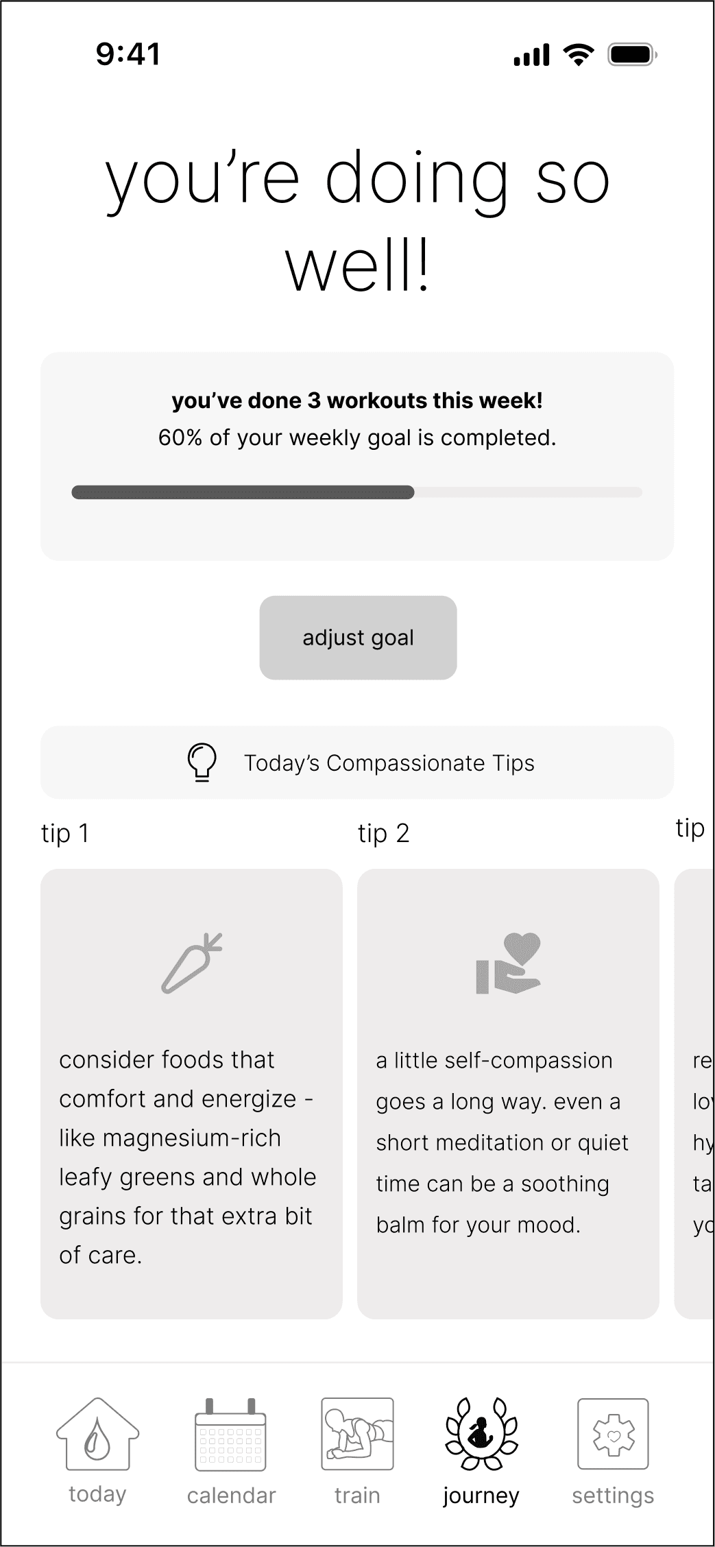
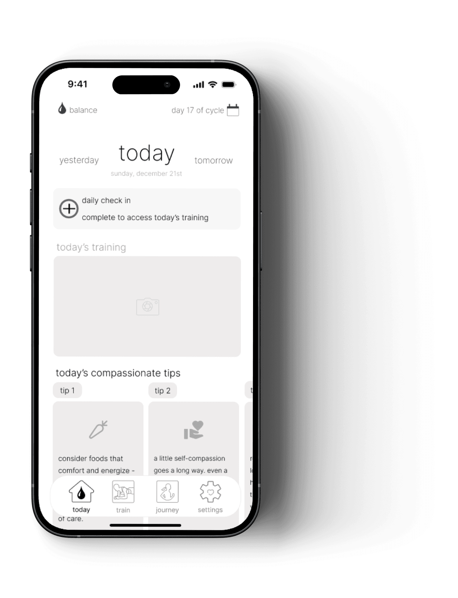
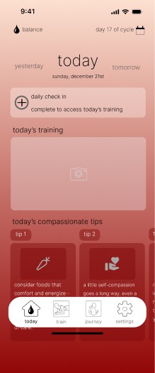
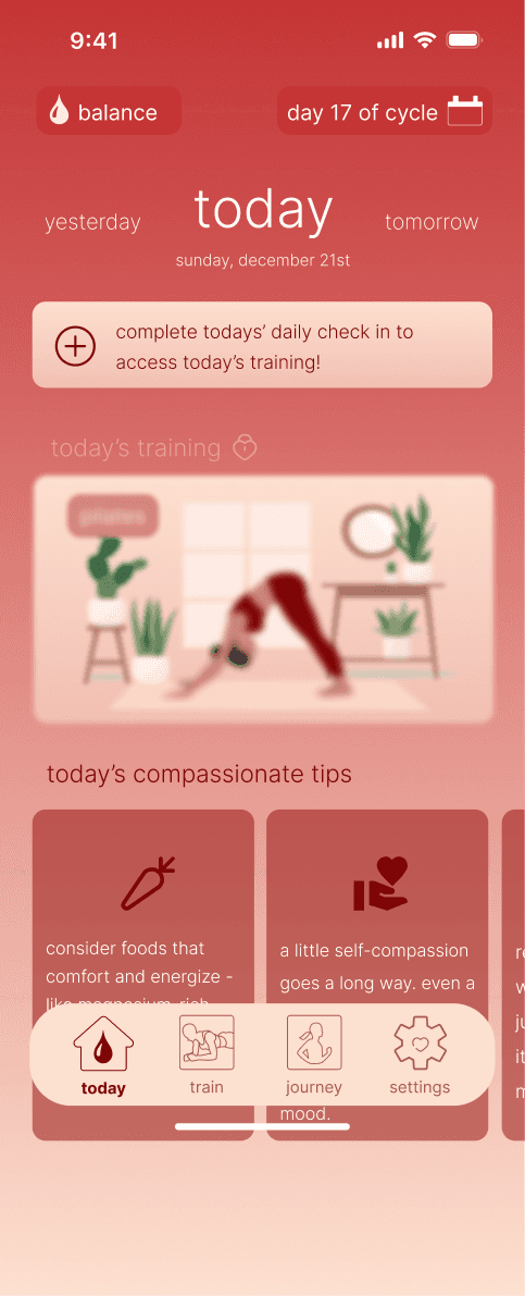
PROTOTYPE V1
In the first round of usability testing, testers engaged with the app's core features, such as the home dashboard, daily check-ins, and training recommendations. They successfully completed tasks, but some found the homepage layout confusing and educational content mistaken for navigational tools.
Their feedback led to actionable changes, like clarifying the training section and revising content layouts for better clarity.
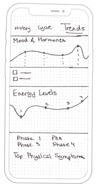
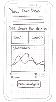
The second round of usability tests focused on the refinements made after the initial feedback. Users found the dashboard more intuitive and the distinction between educational and navigational elements clearer. However, minor issues with text readability and graph layouts were noted, prompting further design tweaks to enhance user experience. The tests confirmed the importance of continuous iteration.
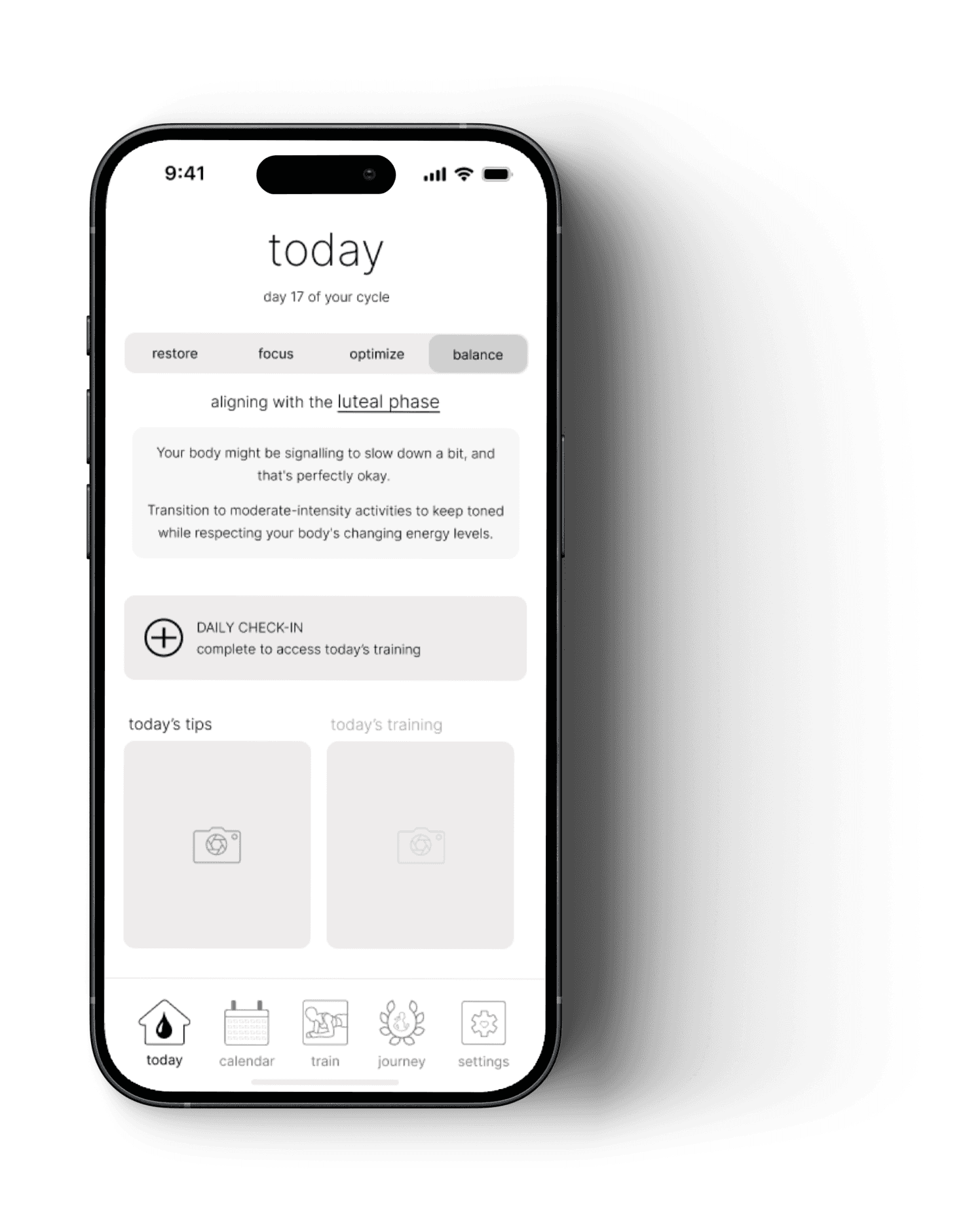
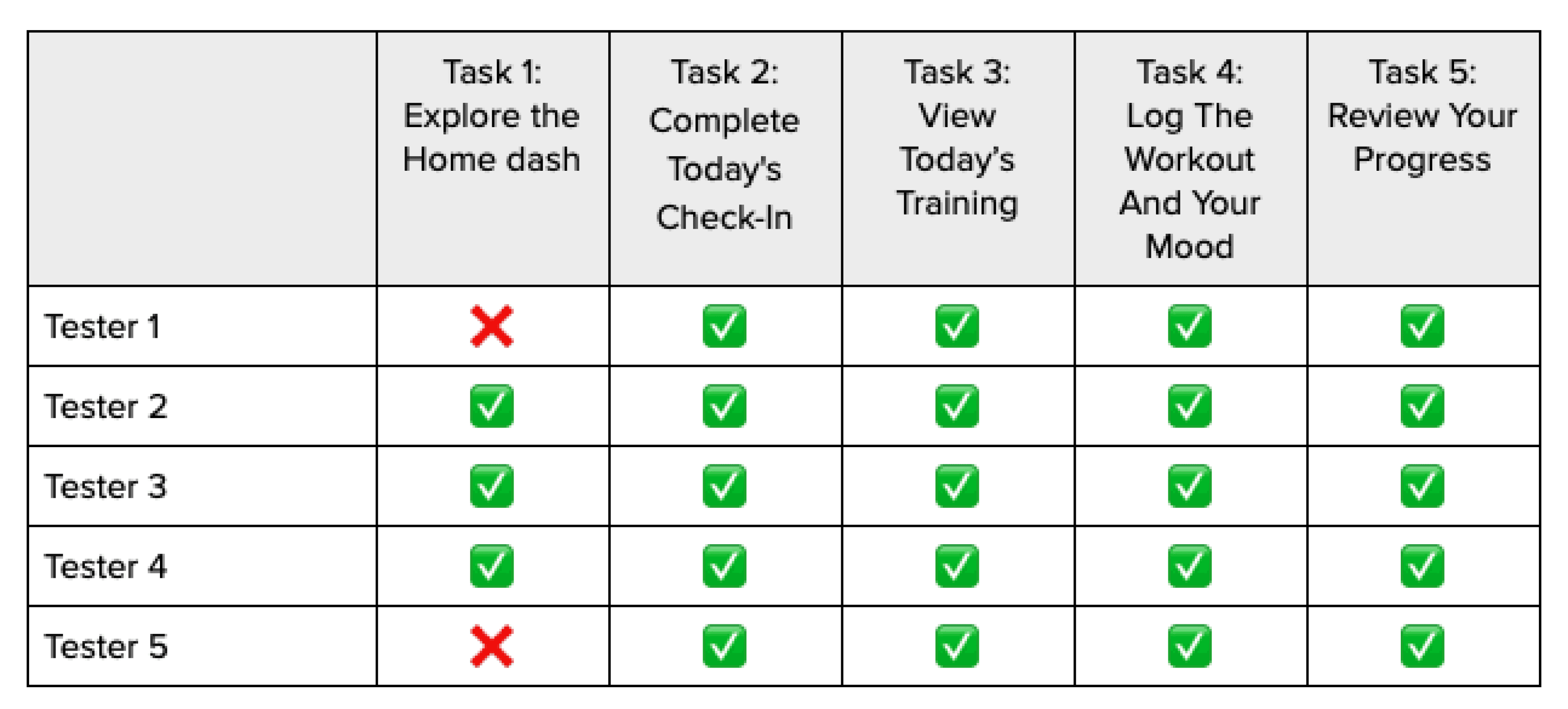
PROTOTYPE V2
The second round of usability tests focused on the refinements made after the initial feedback. Users found the dashboard more intuitive and the distinction between educational and navigational elements clearer.
However, minor issues with text readability and graph layouts were noted, prompting further design tweaks to enhance user experience. The tests confirmed the importance of continuous iteration.

After two rounds of usability testing and a series of iterative designs based on the feedback gathered, the third version of the prototype was ready.
PROTOTYPE V3
This iteration incorporated significant enhancements to improve user interaction and experience, including clearer navigational cues, enhanced readability of text and graphs, and more intuitive access to core features.
The final version aimed to address all the identified usability concerns, striving for a more seamless and engaging user experience that would resonate with the needs of my users.
The importance of an iterative design process, informed by continuous user feedback, cannot be overstated. Usability testing played a critical role in refining the prototype, highlighting what was working well and identifying areas for improvement.
SETTING THE TONE
Transitioning from usability testing into brand development represented a shift from analytical to creative thinking. The testing provided invaluable insights, and it was time for me to channel those findings into a compelling brand identity for the app.
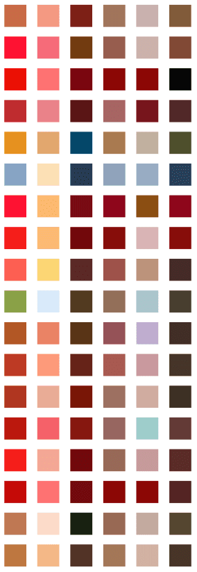
To build a successful brand, I started by selecting six adjectives that personify my brand: Resilient, Nurturing, Progressive, Empowering, Supportive, and Cyclical. I crafted a moodboard with images, colors, and textures representing the brand's values.

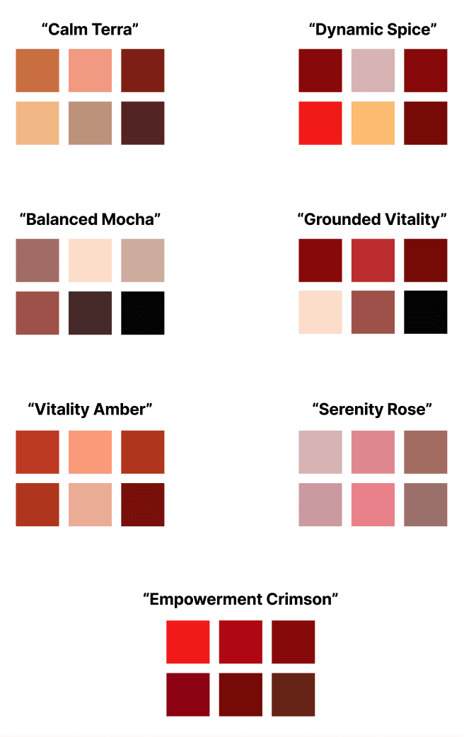
COLOUR EXPLORATION
Journey: Explored colors representing the app's core functionality and evoking the emotions and strength of the female spirit.
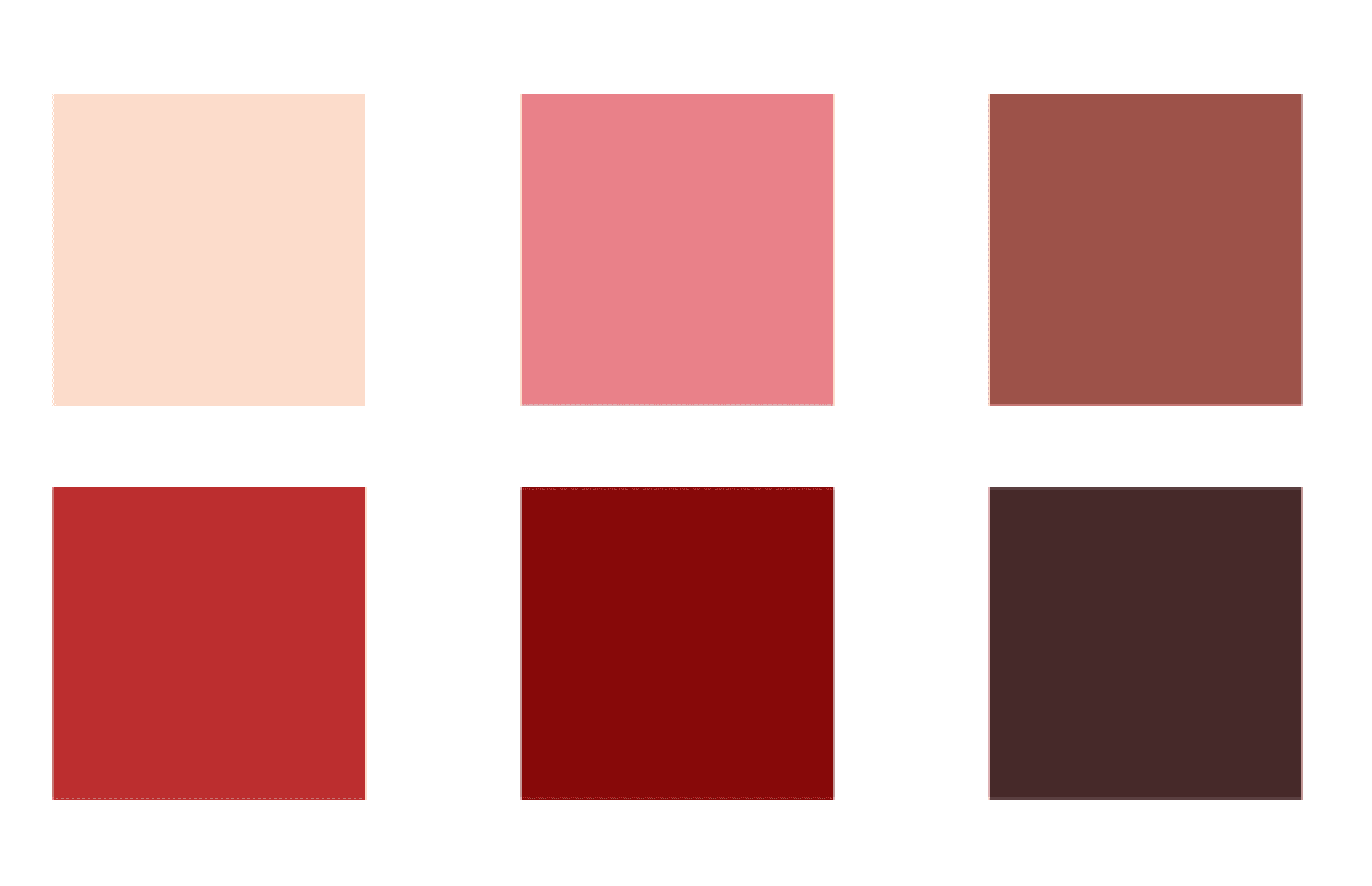
Selection: Chosen colors reflect the brand's core adjectives—empowering, resilient, and progressive. Warm reds signify energy and strength, while soft pinks and beige provide a nurturing touch.
Emotional Connectivity: Colors were selected for their ability to connect emotionally with users, ensuring every interaction feels personalized.
CHOOSING A NAME
Brainstorming: Aligned potential names with the brand's core adjectives and mission.
Final Choice: I chose the name "Align" because it specifically reflect the app's purpose: helping active women align their training with their menstrual cycle, optimizing performance and goal achievement.
WORDMARK
Experimentation: Curated and experimented with different styles, fonts, and weights.
Approachability: Opted for lowercase letters to convey a sense of informality and ease, important for dealing with the complexities of syncing exercise routines with menstrual cycles.
Final Wordmark: Chosen wordmark provides a sleek, modern aesthetic, balancing sophistication with simplicity.

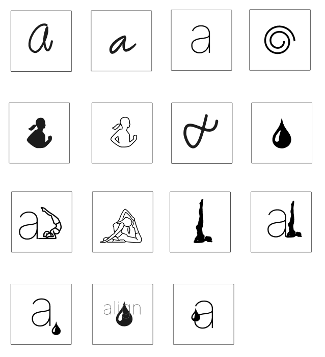
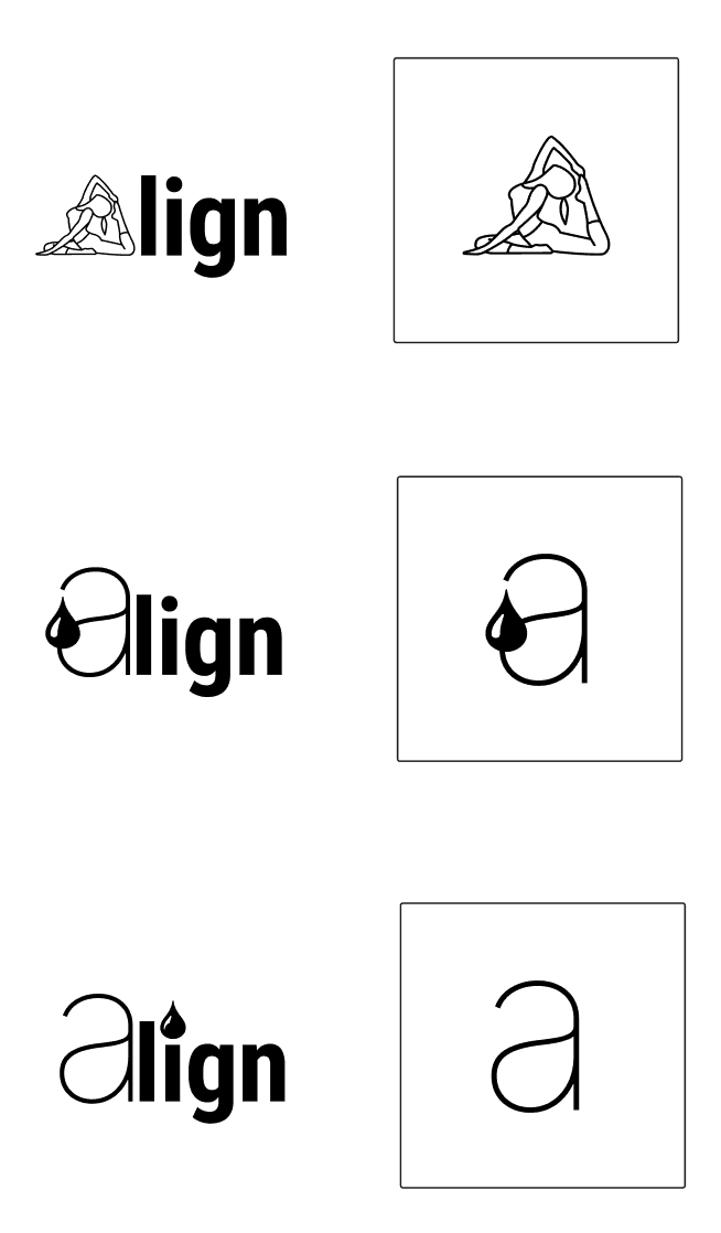
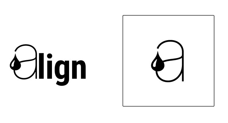
APPLICATION ICON
Design Process: Blended visual elements that resonate with the brand's identity and values.
Options: Narrowed down to three options. Final icon combines the letter 'A' with a drop symbol, representing the menstrual cycle's fluid nature and the app's adaptability.
Final Icon: Encapsulates the essence of the app in a single, powerful image, conveying strength, flexibility, and resilience.

FINDING THE PERFECT FIT
I began experimenting with different shades and gradients, using different colours for different elements, creating a variety of screens to see what reflected the brand. When I was injecting these colours, I realized they do more than just appeal; they function.


UI LIBRARY
Now we dive into the bedrock of my hi-fidelity prototype: the UI Library. A UI library consists first and foremost of a foundation.


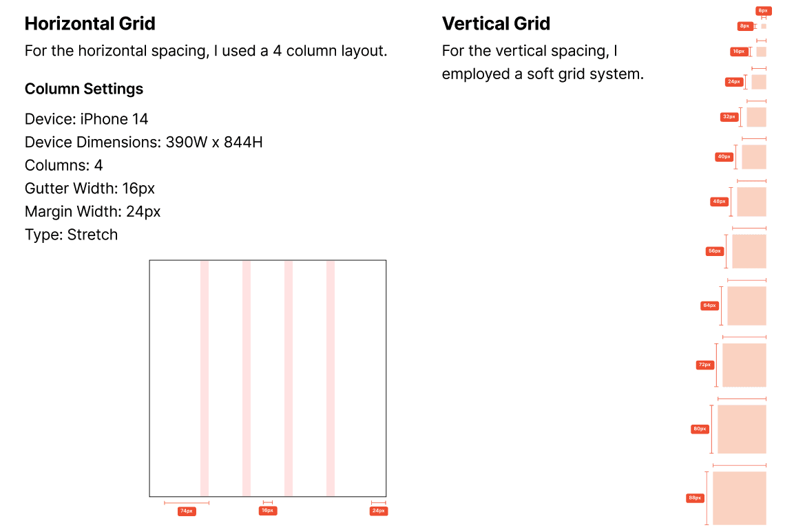
Grids
For the horizontal grid, I chose a 4-column layout. The 4-column design offers a neat, structured layout, ensuring that the interface is user-friendly and information is easily digestible.
For the vertical spacing, I employed a soft grid system. This approach allows for flexible yet structured vertical alignment of elements. I used an 8px base unit for padding and expanded in increments of 8 (i.e., 8, 16, 24, 32, etc.), facilitating a smooth and scalable design.
Typography
For the horizontal grid, I chose a 4-column layout. The 4-column design offers a neat, structured layout, ensuring that the interface is user-friendly and information is easily digestible.
For the vertical spacing, I employed a soft grid system. This approach allows for flexible yet structured vertical alignment of elements. I used an 8px base unit for padding and expanded in increments of 8 (i.e., 8, 16, 24, 32, etc.), facilitating a smooth and scalable design.

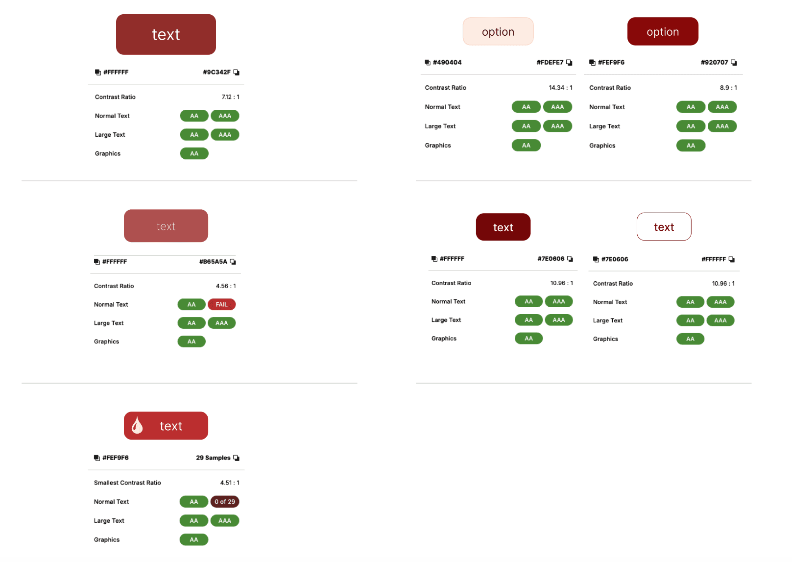
Colour & Accessibility Considerations
For the horizontal grid, I chose a 4-column layout. The 4-column design offers a neat, structured layout, ensuring that the interface is user-friendly and information is easily digestible.
For the vertical spacing, I employed a soft grid system. This approach allows for flexible yet structured vertical alignment of elements. I used an 8px base unit for padding and expanded in increments of 8 (i.e., 8, 16, 24, 32, etc.), facilitating a smooth and scalable design.
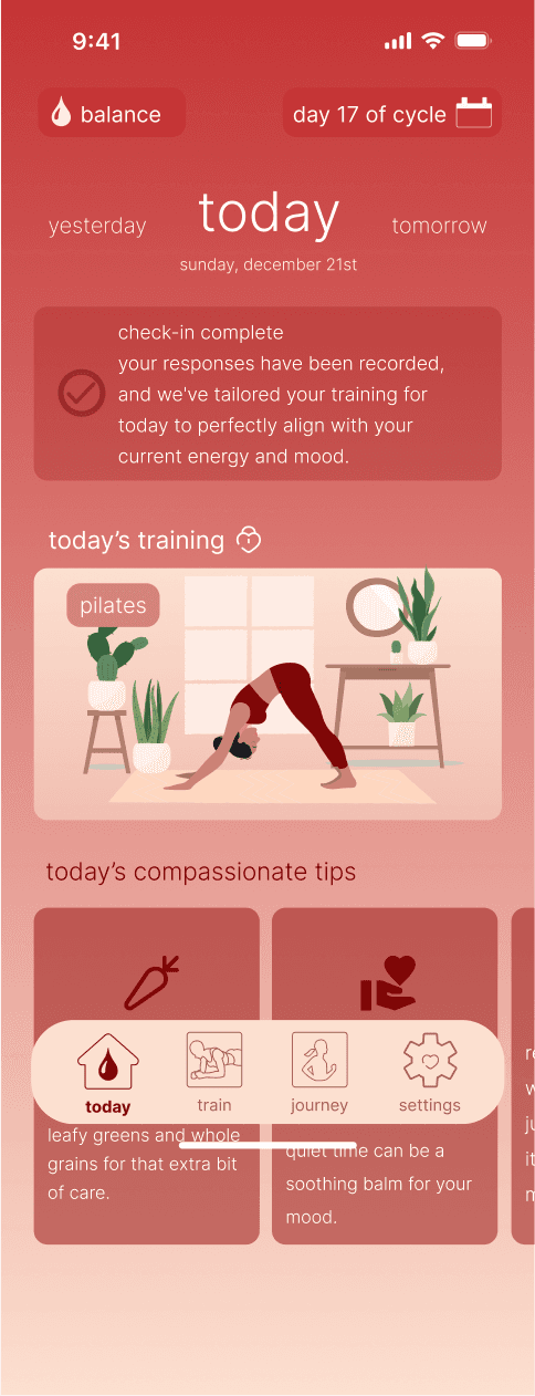
HIGH-FIDELITY PROTOTYPE
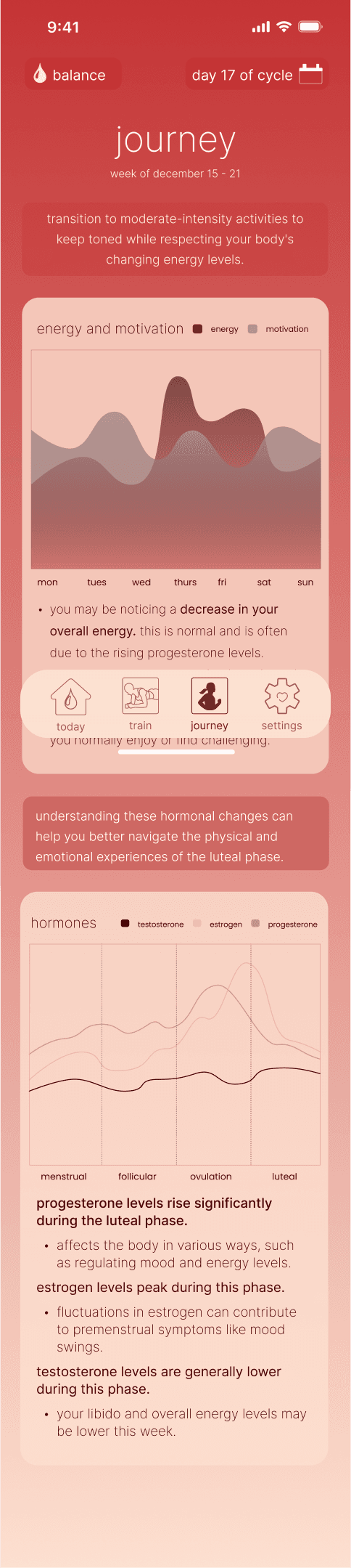
The high-fidelity prototype was the next canvas to bring these brand elements to life. It was about marrying functionality with aesthetics, ensuring that each screen, button, and interaction wasn't just easy to use, but also resonated with the visual identity I had crafted. This wasn't just design; it was about storytelling through visuals, creating a digital space where users could feel understood and supported. The deep reds serve for crucial action items, guiding users with confidence. The lighter shades handle background tasks, maintaining focus without overwhelming.


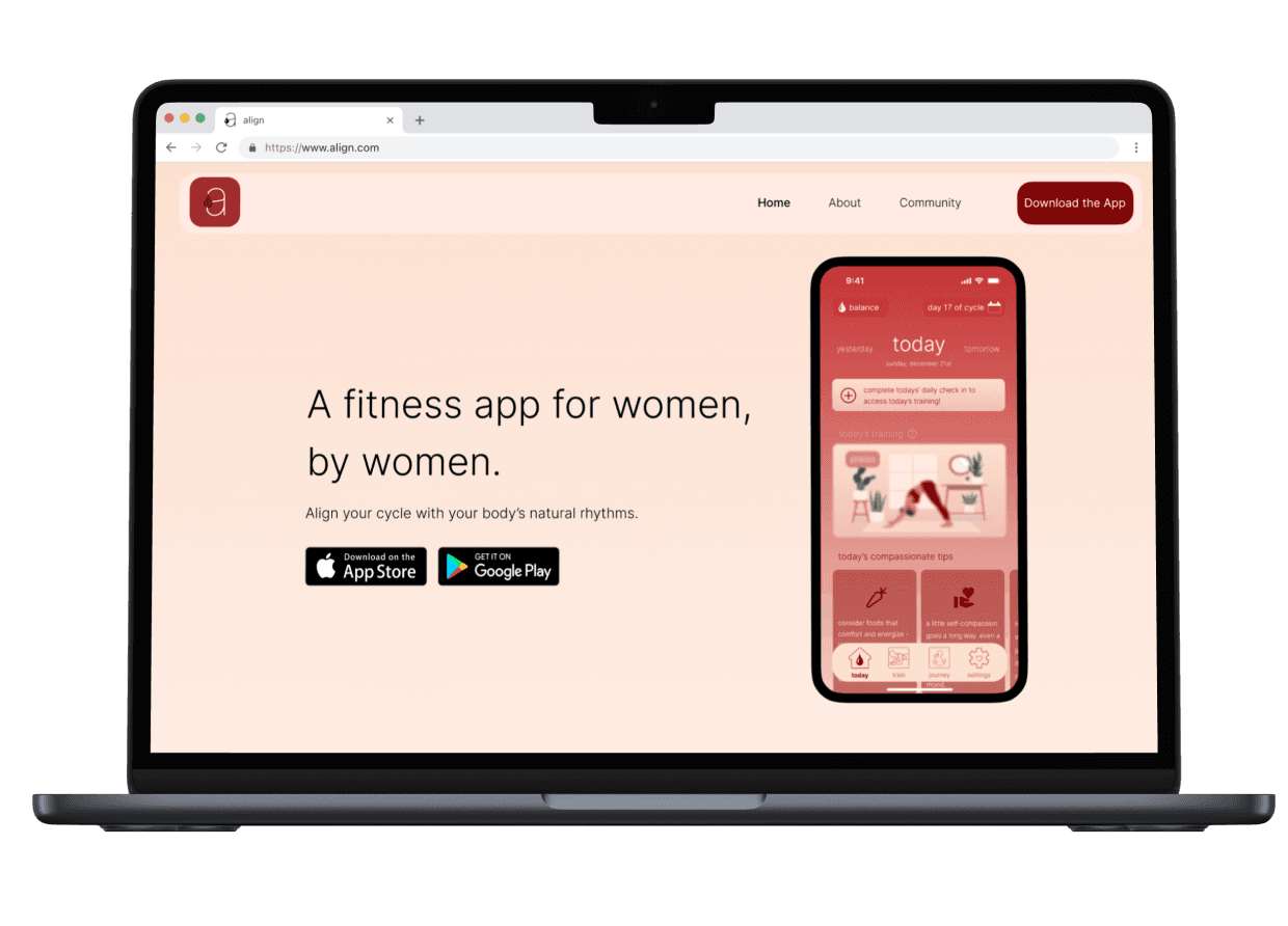
Creating the marketing site prototype for Align, both for web and mobile platforms, was a crucial step in communicating the app's value proposition to a broader audience. This process involved distilling the essence of Align into an engaging, accessible format that highlights its unique features.
In a landscape where digital interaction is paramount, the creation of Align's marketing website is a strategic move towards connecting with a broader audience.

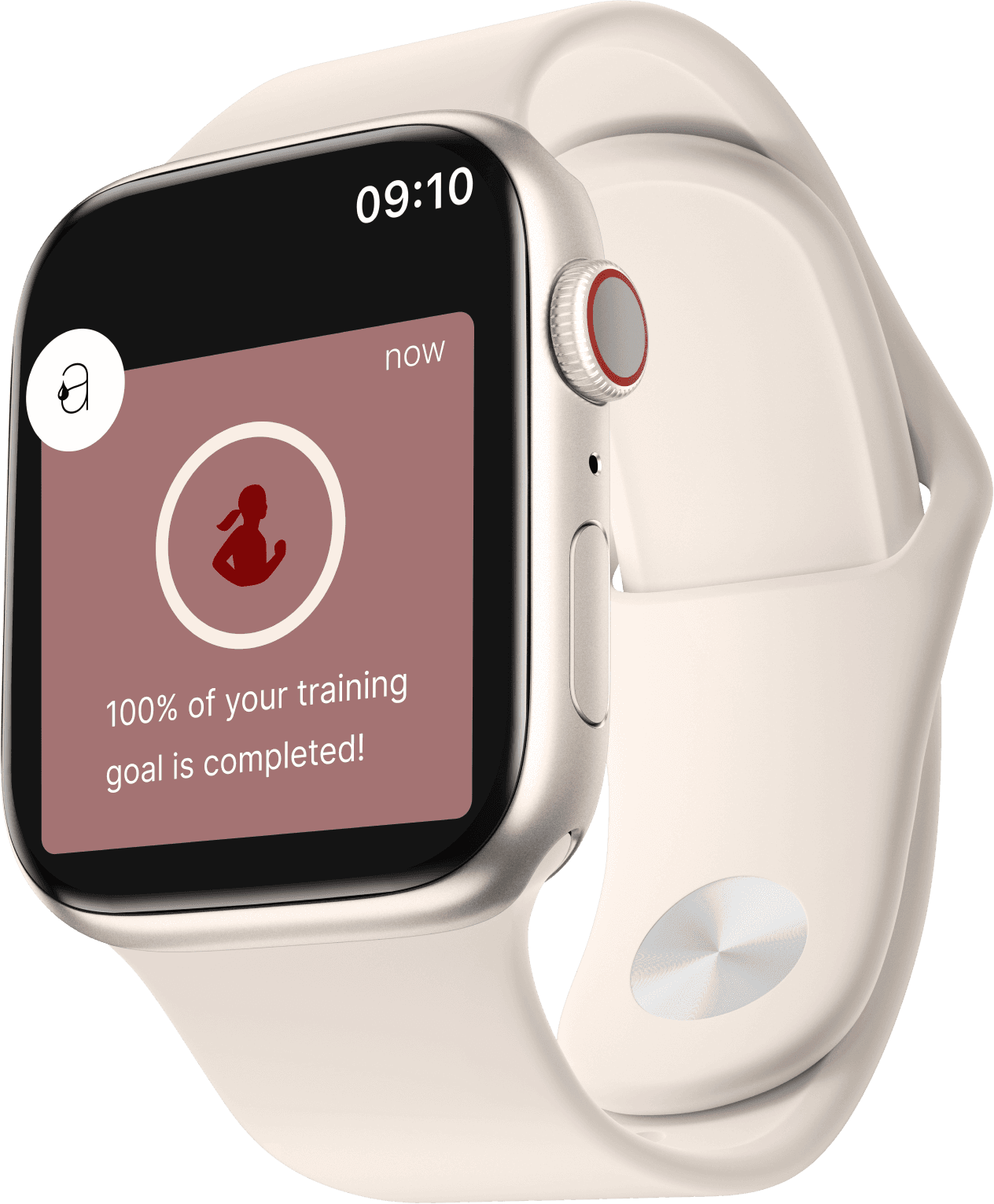
ALIGN ON THE GO
The translation of Align into a format fit for the Apple Watch was a study in distillation. It required taking the app's core functionalities and distilling them into their most essential form, delivering the same personalized experience in a more compact, on-the-go format. This wasn't just about shrinking an app; it was about expanding its reach, making Align a seamless part of the user's life, right there on their wrist.
My journey in creating Align has led me to contemplate the bigger picture of fusing health and technology. Align is not merely about boosting performance; it's about cultivating a profound knowledge and appreciation for the female body. Such an initiative could potentially lay the groundwork for more diversified health technologies that address the specifics of female health, promoting a transformation in societal attitudes towards menstrual health and its influence on women's lives.

REFLECTION
This exercise underscored the significance of compassion and focused study in designing. Gaining insight into the user's environment—especially for intricate bodily experiences such as menstrual cycles—proved vital. The project underscored the benefits of earnestly heeding user narratives and transforming those perceptions into viable, significant actions.
NEXT STEPS
Moving forward, I plan to refine and broaden based on user insights. A more tailored approach towards workout suggestions considering intricate factors such as emotional shifts and distinct symptoms associated with various menstrual cycles will be investigated. Furthermore, establishing a community inside the app where users can exchange thoughts and advice might boost the social interaction feature, transforming Align from a mere instrument to a companion on their health journey.