


CONTEXT
1-week project to redesign an impactful initiative for social change during a bootcamp experience.
TEAM
Tara Corovic
Lindsay Sands
MY ROLE
Interaction and Experience Design, Project Management, Research, Copywriting
TOOLS
Figma
Photoshop
Illustrator
Premiere
AT A GLANCE
During a one-week design sprint, I joined two other UX designers to tackle an exciting challenge: redesigning the donation experience for HeForShe, a global solidarity movement for gender equality. Our goal was to make the platform more engaging and accessible for men, the primary target group.
Through extensive research on social change platforms, we identified key areas for improvement. The existing donation button was difficult to locate, creating a barrier to contributions. Our redesign focused on simplifying the donation process and enhancing the overall user experience to drive greater impact and support for the cause.
THE CLIENT
HeForShe, a global initiative launched by the United Nations, is a solidarity movement aimed at promoting gender equality. It engages men and boys worldwide to actively challenge harmful gender stereotypes and behaviors.
HeForShe's goal: Incentivise millennial men to take action and support gender equality through offering a more engaging and user friendly donating experience.
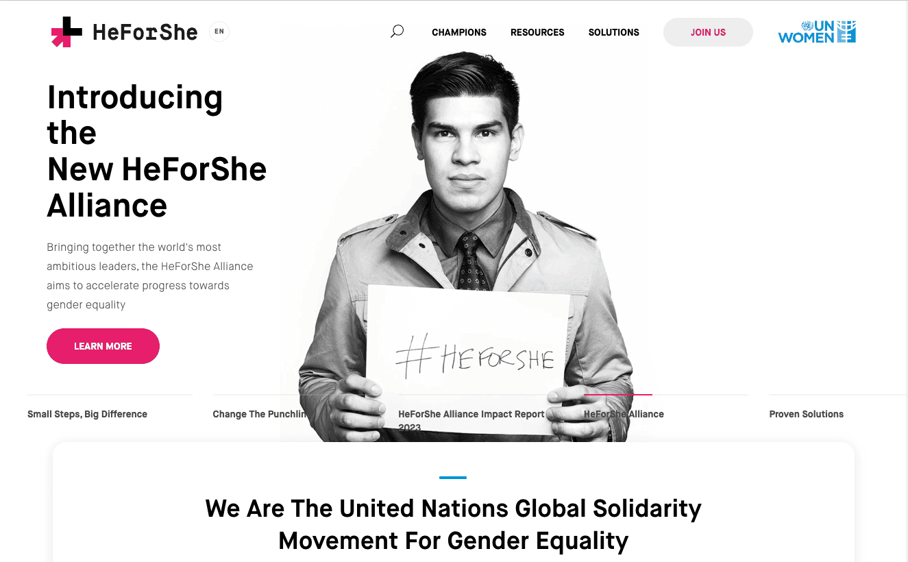

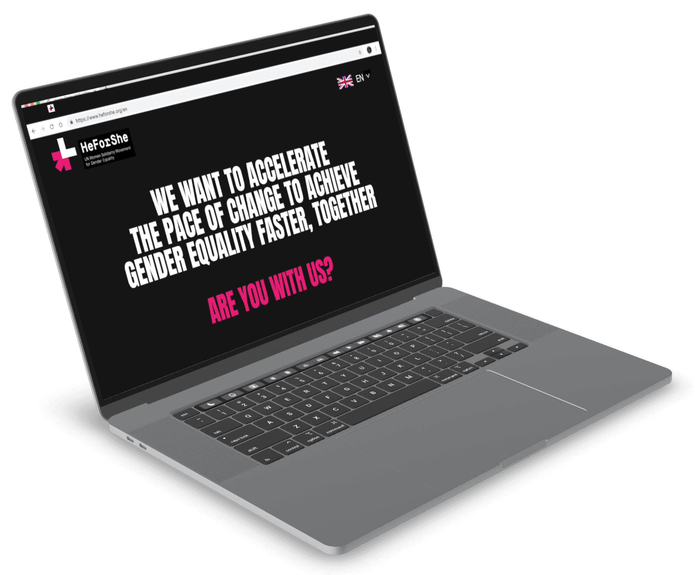
Homepage | HeForShe
https://www.heforshe.org/en

THE PROBLEM
Charities face challenges in donor engagement and fundraising, with a notable 7% drop in 2022. Attracting younger donors is challenging as the 18-35 age group prioritizes socially just and impactful donations, diverging from older donors. The key challenge lies in enhancing user experience and engagement, focusing on information accessibility, navigation, and optimizing the donation process.
WHY MILLENNIAL MEN?
We found that while women give more frequently, men give larger total amounts.
While the HeForShe Campaign focuses on engaging men and boys in general, we chose to focus on Millennial Men specifically because they exhibit a higher likelihood of making charitable donations.


RESEARCH GOALS
In order to get better insight into the situation, we conducted 3 user interviews and 5 usability tests.
Our Research Goals were to:
1. Investigate the disparity in donation preferences
2. Find a way to bridge the disparity gap
We set out to delve deep into this by conducting interviews with three millennial men. These interviews were designed to be comprehensive, ensuring we captured a holistic view of their interactions with the site.
During the testing phase, we guided each user through the current HeForShe site, observing their navigation habits and noting any challenges they faced. It was a revealing process: despite their digital proficiency, none of the participants could locate the donation button without assistance.
Participant 1: Struggled with the cluttered homepage and suggested a cleaner layout
Participant 2: Could not locate the donation button even after multiple attempts, indicating poor visibility.
Participant 3: Expressed a desire for more intuitive navigation, emphasizing the need for simplicity.
With these insights in hand, we moved on to the affinity mapping process. This map showcases the clusters of feedback we gathered, highlighting the common themes and critical areas for improvement.
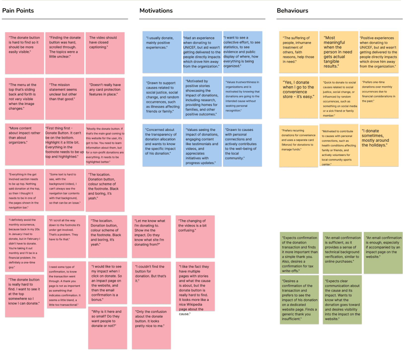
Participant 1
Pain Point
Had an experience when donating to UNICEF, but aid wasn't getting delivered to the people directly impacts which drove him away from the organization.
Motivation
Motivated by seeing a collective effort, statistics, evidence and public display of where, how everything is being organized
Behaviour
Donates to causes that showaid actually being delivered, budgeting transparency, testimonials of people receiving aid.
Participant 2
Pain Point
When charitable organizations don’t provide me with something that indicates confirmation after I donate. It seems a bit transactional.
Motivation
I want to see the stories of the real people that the charitable cause is supposed to be helping.
Behaviour
I'm drawn to stories that showcase the positive impact and effectiveness of charitable organizations. Seeing the good that donations achieve motivates me to contribute.
Participant 3
Pain Point
Uncertainty about how donations are allocated and whether I can specify the cause.
Motivation
I seek clarity and control over my donations, wanting to know where my money goes.
Behaviour
I look for donation transparency and clarity, and I prefer causes that offer these features.
Next to the affinity map, you'll find the key insights from our three participants. The patterns were clear and undeniable—users were eager to support HeForShe but were hindered by the website’s design. Our mapping revealed that the donation button’s visibility and accessibility were the most significant pain points.
INTERVIEW INSIGHTS
From our research and affinity mapping, three major insights emerged:
Streamlined Navigation
Ease of finding and using the 'donate' button directly impacts willingness to engage and contribute.

Positive Stories
Sharing positive outcomes and the tangible impact of donations boosts engagement and reinforces commitment.

Transparency & Accountability
Millennial men want clear information on how their funds are used and the difference they're making.

From our research and affinity mapping, we found 3 opportunities for improvement:
+
Transparency was a recurring theme in our feedback. Users want to know exactly how their donations are being used and the impact they are making.
+
Users expressed a desire to see more success stories and positive impacts of their contributions. Integrating these stories throughout the site can inspire and motivate potential donors.
+
Users found the current navigation cumbersome and confusing. By decluttering the homepage and providing clear pathways, we could enhance the overall user experience.

PERSONA
Meet our primary user, Ali, a conscientious 30-year-old Data Scientist in Los Angeles. His frustrations and motivations emphasize the importance of clear information and transparent experiences in motivating donations.
We revised our HMW statement, keeping the user at the centre of our solution: How Might We help millennial men see the direct impact of their contributions by providing them with transparent and engaging insights, so that feel more connected to the cause they’re donating to?
Once we decided on a navigation flow that would optimize our users experience, we made final sketches which acted as a blueprint for our prototype.


Through refinement, these sketches and wireframes evolved into prototypes that are aligned with our project goal, translating the HeForShe's mission into a compelling digital narrative.
THE FINAL PROTOTYPE
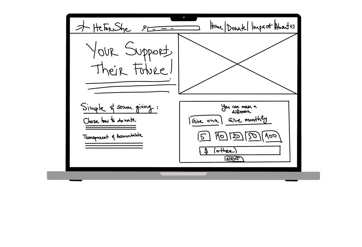
The key change involved repositioning statistics from post-donation to pre-donation, creating a more compelling and informative user experience. Accessibility and readability issues were addressed, and technical glitches with interactive elements were fixed.
Each iteration incorporated insights from interviews and user tests to optimize design for increased donor engagement and impact amplification.
USABILITY TESTING
In user testing, participants explored the HeForShe website for the first time, focusing on gathering information about the cause, organization identity, and impact before considering a donation.
Tasks Assigned
Task 1: Explore the Homepage
Task 2: “About Us” page
Task 3: Donate
Task 4: Complete the checkout

Homepage | HeForShe
https://www.heforshe.org/en


Testing showed that three out of five users encountered challenges with Task 3, re-emphasising the need to streamline the donation process.
After prioritizing user-preferred solutions using a design prioritization matrix, significant enhancements were made to the old prototype to enhance overall usability.


ITERATE, ITERATE, ITERATE
After prioritizing user-preferred solutions using a design prioritization matrix, significant enhancements were made to the old prototype to enhance overall usability.
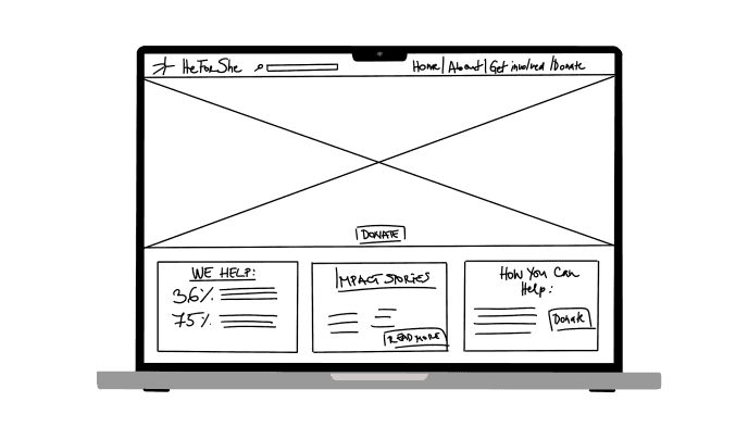
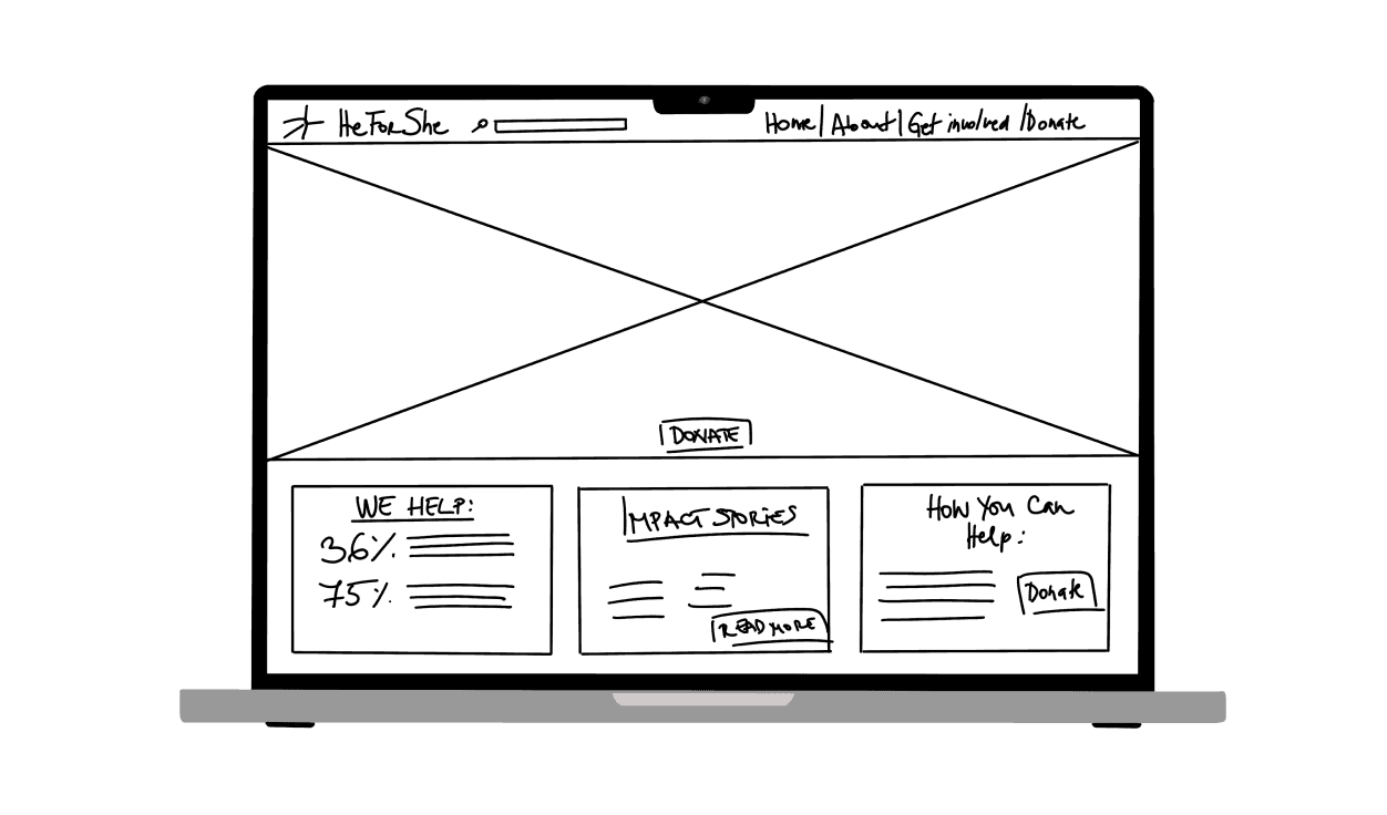
Understanding Ali's preference for clear and logical solutions, I redesigned the donation platform to be intuitive and user-friendly. The prominent placement of the 'Donate' button on the homepage ensures it captures immediate attention, eliminating any frustration of searching for it.
I incorporated a 'witnessing change' section, showcasing impact stories and data that highlight the tangible results of donations. This transparency is crucial for users like Ali, who value seeing the direct impact of their contributions.
I designed the donation process to be straightforward and secure, with clear demonstrations of fund allocation, making it easy for users to understand where their money is going.
Each step, from entering details to receiving a thank you page, was crafted to foster a deeper connection with the cause and reinforce the user's sense of purpose and impact.
ALMOST THERE
Positive Impact and Stories
Clear and Open Communications
Motivation and Satisfaction
Ali's story is not just about the challenges he faces; it's a reflection of a broader issue in the digital philanthropy space. It highlights the need for donation platforms that not only align with the technological advancements of our time but also resonate with the values and expectations of conscientious donors like him. He represents a growing demographic of socially conscious individuals who are seeking more than just a transactional experience in their philanthropic endeavors.]
Users are motivated by positive stories that vividly illustrate the impact of their donations. Testimonials, case studies, and detailed reports serve as powerful tools, fostering continued support and engagement. The desire for tangible evidence of how contributions are utilized and the direct benefits they provide underscores the significance of clear and open communication in donor satisfaction.
In order to appeal to our target audience: millennial men, the HeForShe movement needs to be transparent about where donations go and the impact that these contributions are having.

REFLECTION
Looking ahead, our focus is on iterative development, another round of user testing and prototyping is planned before entering the development phase. Post-launch, we will diligently monitor website analytics and donations, ensuring the success of our redesign in seamless integration with HeForShe platforms and campaigns.