


CONTEXT
A 24-hour hackathon for Royal Caribbean's "New-to-Cruise" line as part of a Brainstation course.
TEAM
Kara Cheng
Justin Ma
Boubacar Traore
Yacine Amrouche
Jose Liquet
Ben Heaps
MY ROLE
Interaction and Experience Design, Project Management, Research, Copywriting
TOOLS
Figma
Figjam
Github
Photoshop
Illustrator
AT A GLANCE
I served as one of two UX designers on an interdisciplinary team during a 24-hour hackathon with Royal Caribbean International. Our challenge was to create an innovative solution to attract more new-to-cruise customers. We aimed to develop a user-centric feature—a modal popover on the cruise line's website—that identifies and caters to the unique needs of first-time cruisers.
By designing an engaging quiz that guides new users toward personalized cruise options, our goal was to simplify their decision-making process, enhance their booking experience, and ultimately increase Royal Caribbean's conversions.
THE CLIENT
A global leader in the cruise industry, Royal Caribbean International offers innovative and unforgettable vacation experiences on the high seas. The company caters to a diverse clientele ranging from families to adventure-seekers. Their dedication to excellence and innovation makes them a prime example of a brand that places user experience at the forefront of its business strategy.


THE PROBLEM
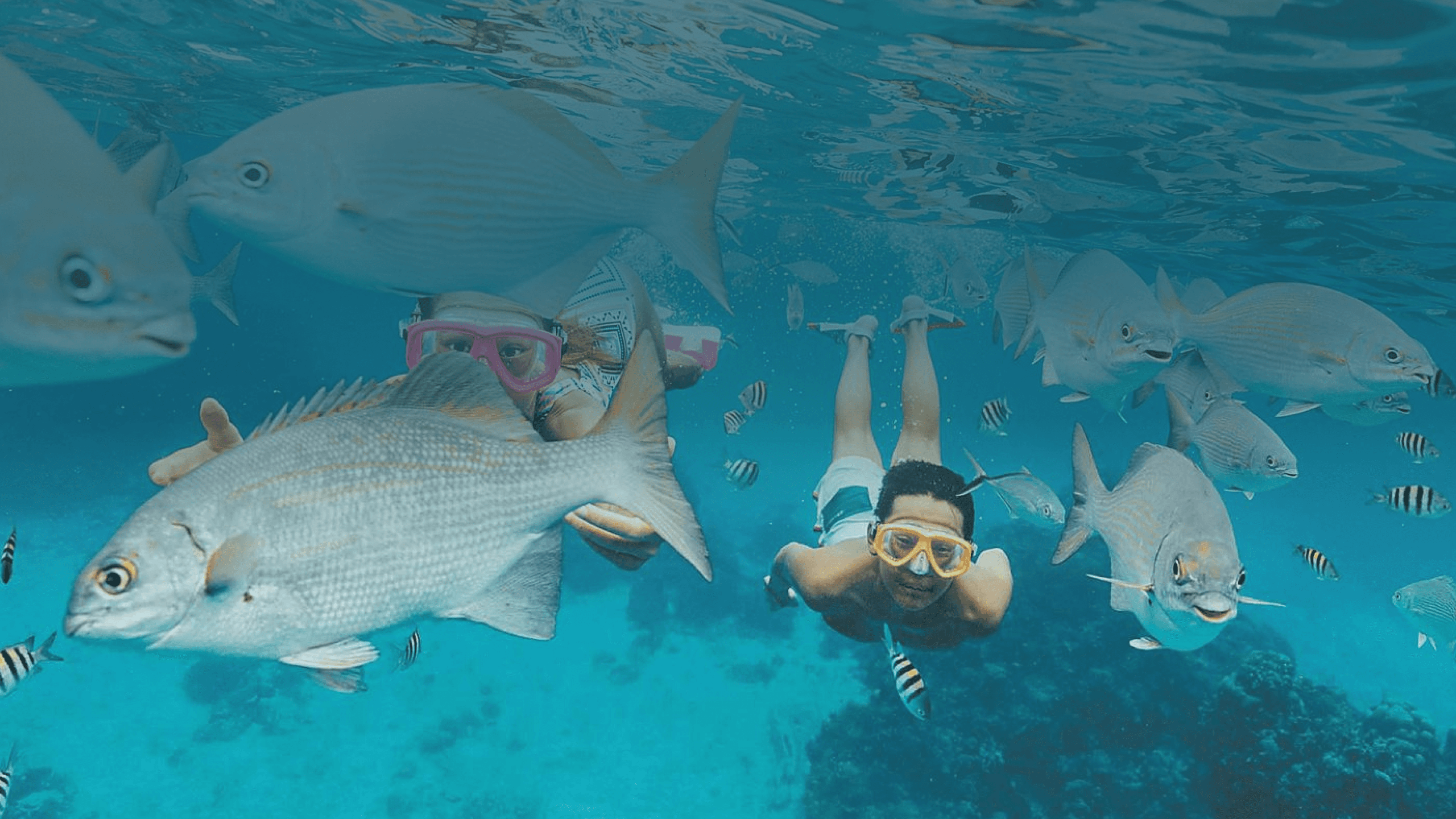
The "new-to-cruise" segment comprises individuals with no cruise experience, but are curious to learn more about cruising as a vacation option. Although the Royal Caribbean site offers a wealth of information for first-time cruisers, the content is very dense. New cruisers, who may already feel apprehensive about booking, might not have the patience to sift through all of it.
Through conversations and observations, we discovered Royal Caribbean's goals:
Generate interest in cruises among those unfamiliar with them.
Reduce information overload for new users.
Address the emotional journey of first-time cruisers.
Decrease the high drop-off rates during the booking process.
As one of the lead researchers, I initiated a creative brainstorming session using FigJam as our collaborative platform. Our team began with an in-depth evaluation of the existing site to assess its effectiveness in attracting new-to-cruise customers. We used methods such as on-site visits and observation, note-taking, and market research involving both our client and their customers. To extract key insights from the substantial amount of data collected, we created an affinity map and organized our ideas thematically.

This comprehensive approach helped us paint a clear picture of the motivations, obstacles, and needs of Royal Caribbean International's target audience: New cruiser's. We found that their limited understanding of the cruise product leads to confusion and frustration as cruise terminology and brand-specific products can feel more alienating than inviting.
With our research in mind, we asked ourselves: How might we offer learning opportunities and deliver a unique shopping experience for our “new-to-cruise” customers that inspires confidence in their purchase?
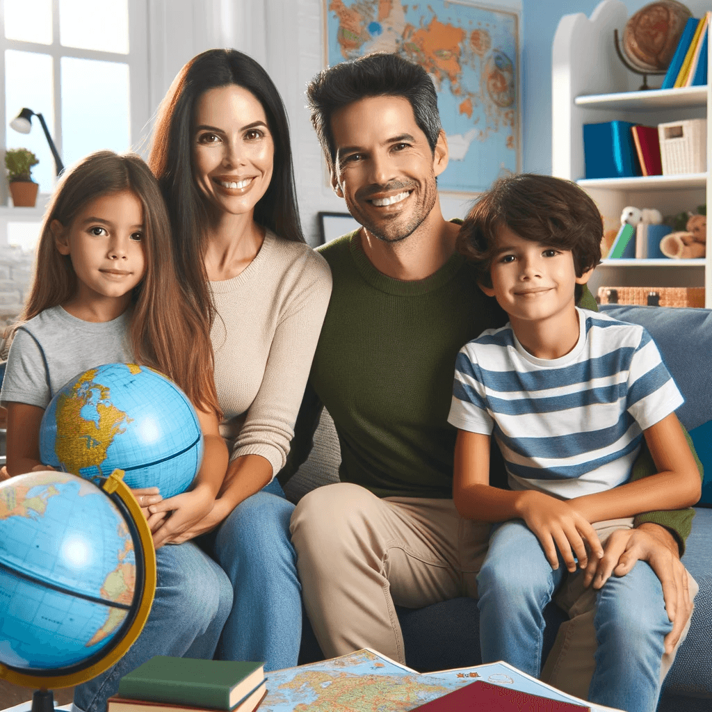
These findings then helped us with creating our initial user journey map, through which we narrowed down the three main users - families, couples, and single individuals.
Our insights pointed us to three different opportunity spaces:
Reduce the cognitive overhead of selecting a cruise (provide tangible value related to ease of use)
Foster curiosity and excitement for discourse surrounding cruises (intangible value)
Create a supportive space dedicated to new cruisers (aspirational value of belonging and active participation)
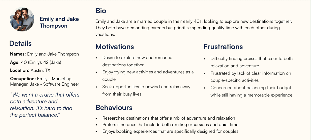
WHO ARE WE HELPING
Discovering the motivations behind each user group was essential in guiding us in the right direction. At this point, our team created a tangible personas to further aid in our design direction.


Having gathered research, completed the user journey maps and personas, my team and I arrived at two different design directions:
1. Streamlining Cruise Selection
Our research showed that Royal Caribbean's website frequently attracts first-time cruisers who often feel overwhelmed by the sheer number of options and the complexity of the booking process. These users need clear, intuitive guidance to help them navigate their choices without feeling lost or frustrated. By streamlining the cruise selection process, we can make it easier for these beginners to find and book the perfect cruise. This benefits both parties as new cruisers can easily book their dream vacations, and Royal Caribbean enjoys higher booking completion rates and satisfied customers.
2. Gamification
By integrating game-like elements into the booking process, such as an AI chatbot, reward systems, and other engaging features, we can transform a daunting task into an enjoyable adventure. Gamification not only enhances the user experience by making the process more fun and interactive but also fosters a stronger connection to the brand.
Given our time constraints, we quickly realized that integrating AI or comprehensive gamification features would be too time-consuming. Recognizing this, we propose to address new-to-cruise users needs by integrating an interactive quiz feature on the platform. By asking relevant questions, the quiz would provide personalized cruise recommendations, easing decision-making process.
Next, we quickly sketched out the quiz layout to provide the development team with a clear framework to start building the base.

BRINGING IDEAS TO LIFE
While the developers started working on the foundational structure, I, as one of the two designers, took on the task of translating our conceptual drawings into structured wireframes. Using Royal Caribbean's brand guidelines and information architecture, I ensured that every element aligned with their established visual identity.

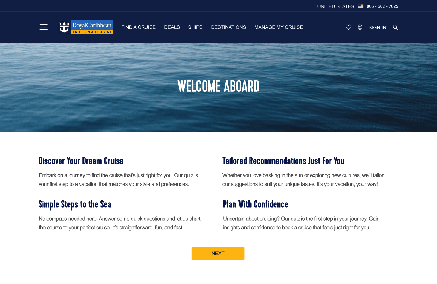
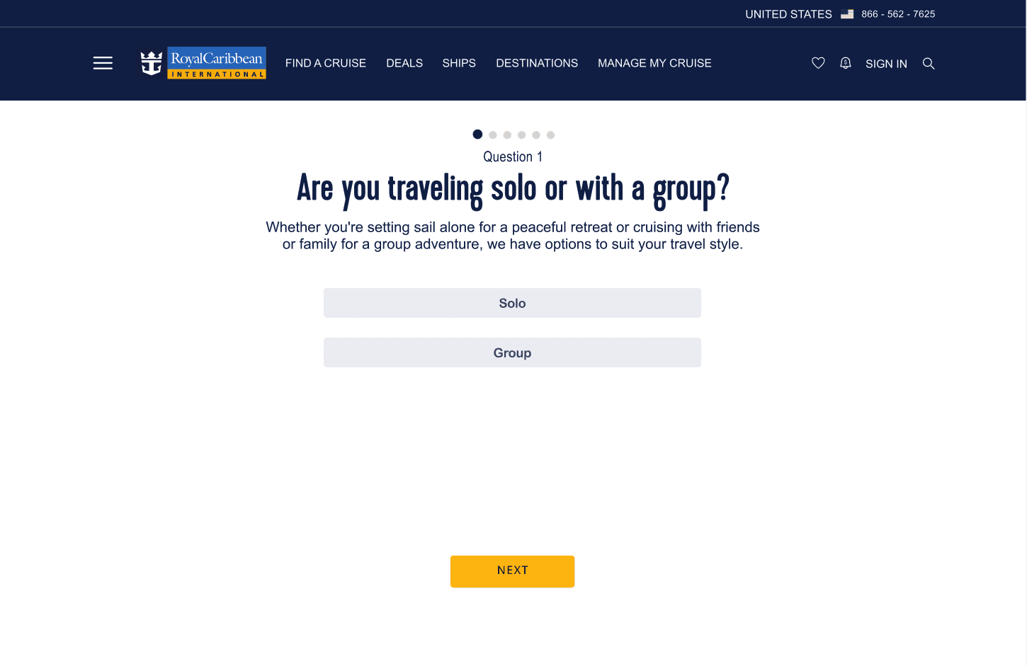
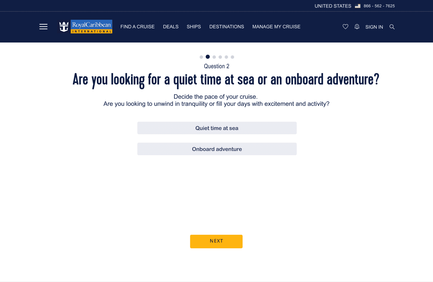
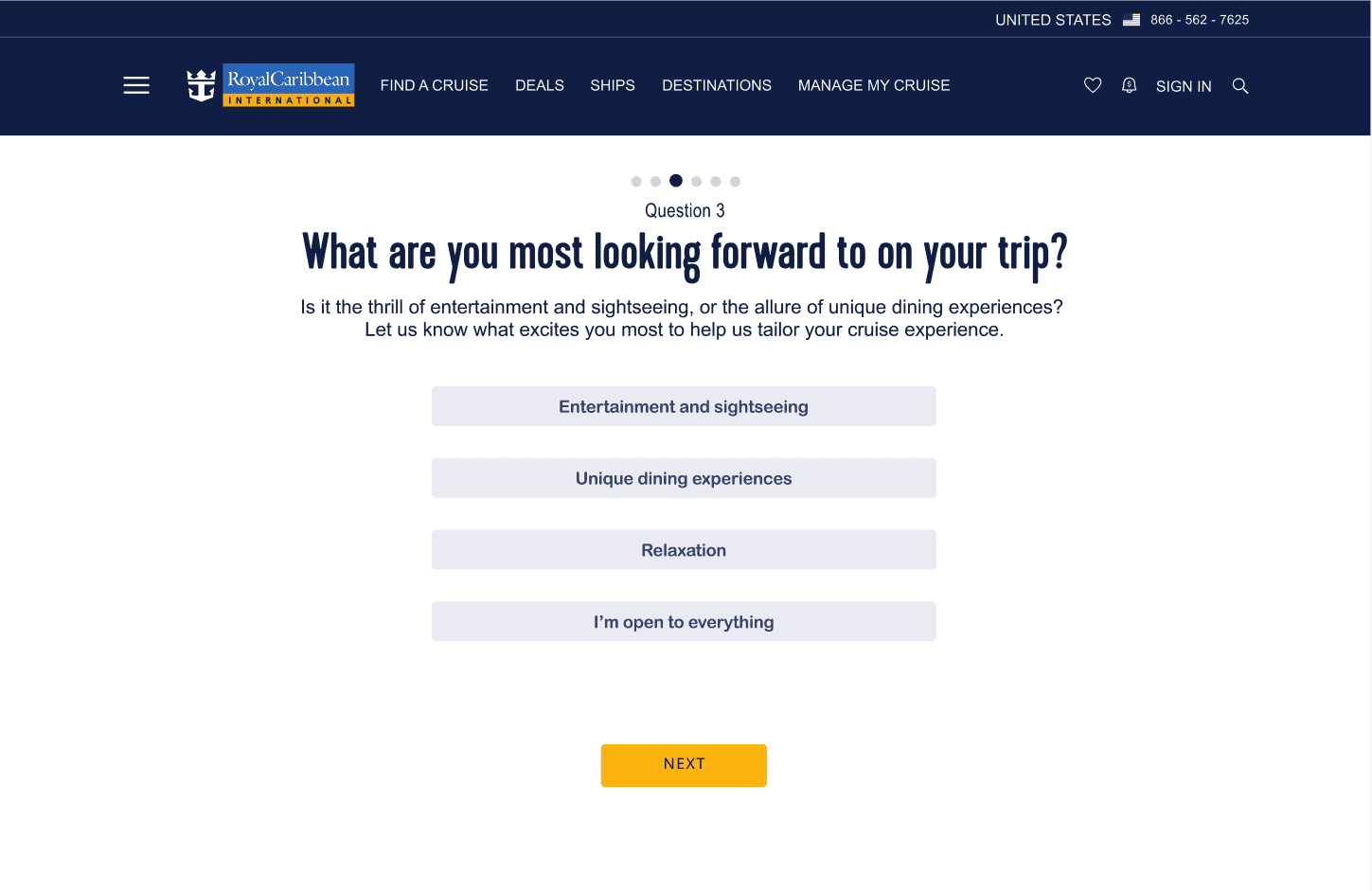

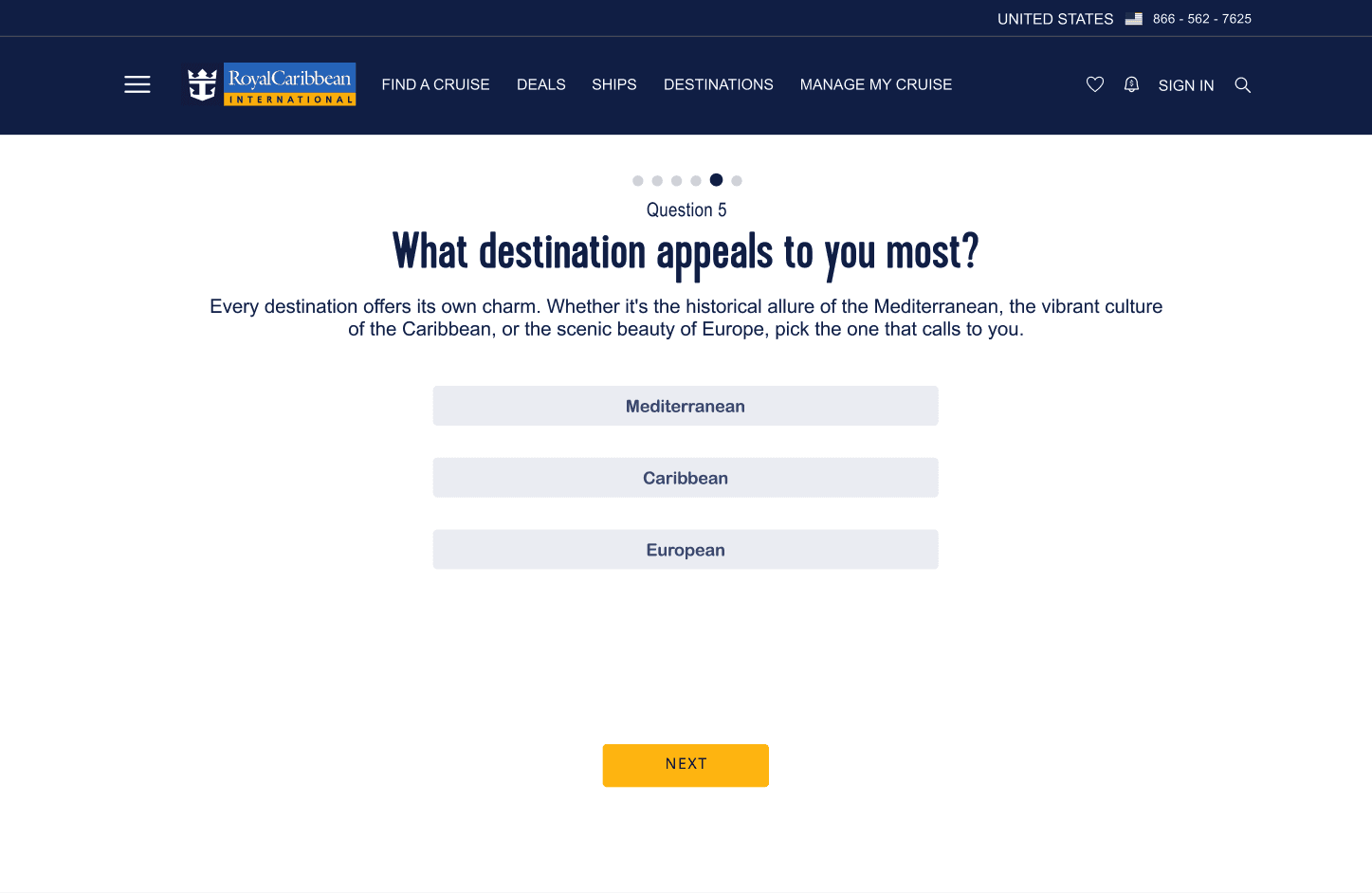
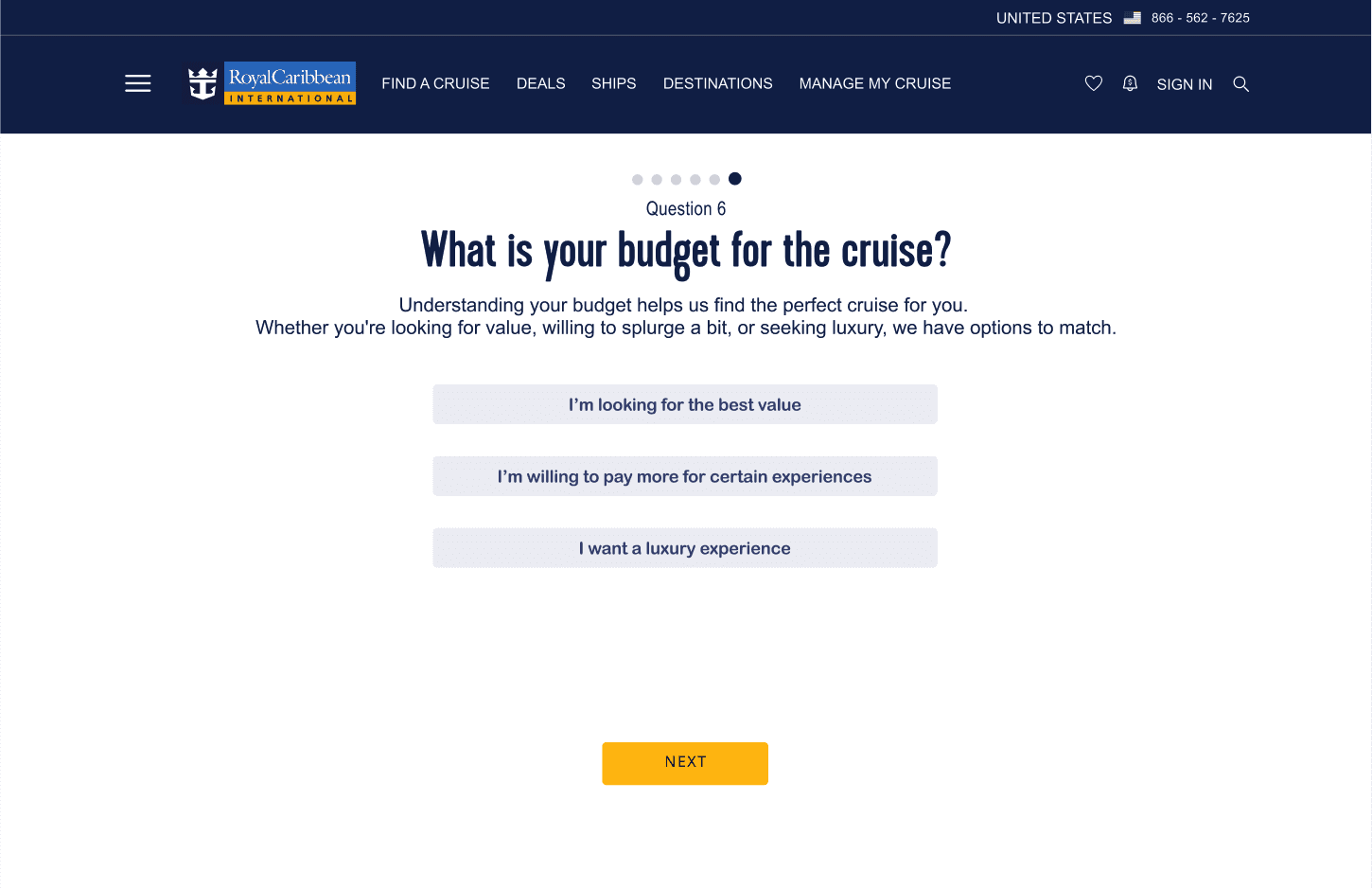


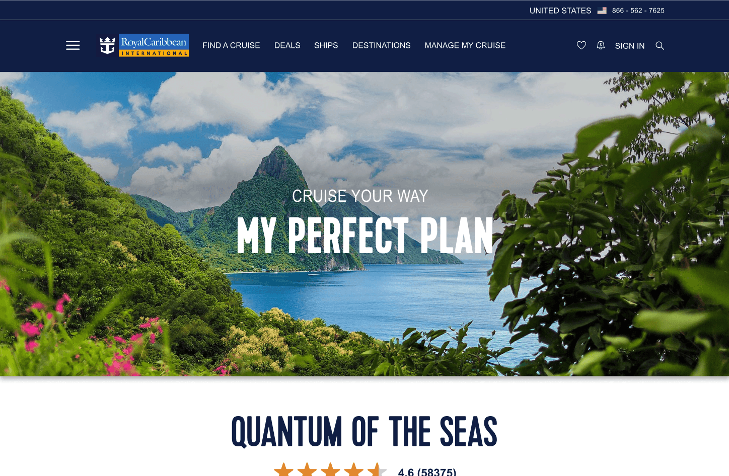

Given the tight timeframe of the hackathon, we quickly moved into rapid prototyping. This allowed us to create functional models of our designs, providing a tangible sense of interaction and flow, as well as a UI library, making it easier to hand-off to developers. It was a challenging yet exhilarating process, and seeing our ideas come to life so quickly was incredibly rewarding.
THE PROPOSAL
The UX team took the lead in project planning and synthesizing our work into a comprehensive presentation for the Royal Caribbean team. We introduce an interactive quiz feature for the website to address the needs of first-time cruisers. This solution aims to:
Providing value to new cruisers by giving them the guidance they need to find a cruise specifically for them
Reduce cognitive overhead by streamlining the research process through an engaging quiz
Providing value to both users and the business by enhancing the user experience and potentially increasing conversions.
ALMOST THERE
Our team was thrilled to come very close to winning, ultimately securing second place. Although we didn't take the top spot, the judges' feedback was incredibly encouraging. They commended us for our highly organized presentation and our ability to stay true to the Royal Caribbean brand, which felt like a huge win in itself.
Post-hackathon, we were inspired to further refine our interactive quiz. In the second version, we incorporated feedback to enhance personalization and added more tailored recommendations, as well as engaging visual elements like interactive maps and connected the them to the cruise previews to make the experience more immersive.
REFLECTION
This project was my first introduction to working with a real client as part of a bootcamp and it really broadened my understanding of interaction and experience design. I was really proud of my team and I's ability to create a polished and meaningful intervention for Royal Caribbean's website. Our collaborative environment, filled with iterative feedback and shared decision-making, really highlighted the strength of our team's combined expertise. Using Figma's developer mode to create a comprehensive UI library was a game-changer; it helped us communicate our design decisions clearly and keep everything organized. This project also opened my eyes to the intersection of technology, business, design and experience as there was a lot of business research that went into it and while the user was at the forefront of the journey, so was the client.