


About the project
Building a two-sided platform for students to find care and therapists to find freedom
The Evexia team reached out to me with a clear challenge: how can we make the process of finding and booking therapy easier for both clients and therapists — without it feeling like another clunky healthtech tool?
We started with the core. Most therapy platforms try to do too much too quickly. So instead of chasing every feature, we focused on what mattered most: building a simple, stress-free booking flow that feels good to use. For students, that meant clear access to support they could actually trust. For therapists, it meant an easier, independent way to offer care without the overhead of opening a clinic or relying on directories that don’t work.
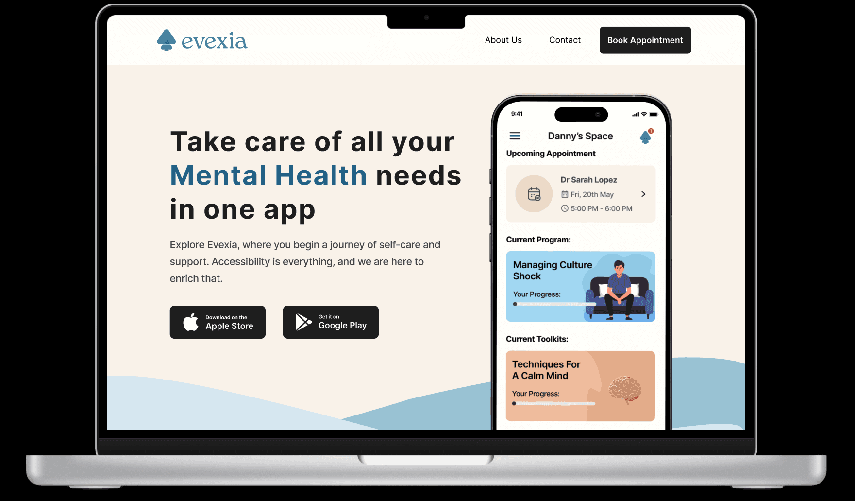
I designed the initial MVP for mobile, and we’re now bringing that experience to the web alongside a new design system that will support the product as it scales. A programs and toolkits feature is also in the works, but we’ve chosen to launch later so we can keep the core experience focused, useful, and fast.
MY ROLE
UX Research, Interaction & Experience Design, Wireframing, Prototyping, Usability Testing, Leadership
METHODOLOGY
Design Thinking
Agile Methodologies
Iterative Testing
TOOLS
Background
Evexia is a Canada-based mental health startup that connects students seeking affordable therapy with therapists who want flexibility and ownership over their work.
Evexia’s entire design team — that was me.
I joined in early 2024 as their first and only designer, with no existing product and a small, early-stage team. I led the design of our mobile MVP from the ground up, and have since grown into a leadership role, now managing a team of two designers and leading both UX and UI across key areas of the platform.
Some of the things I’ve achieved at Evexia:
Designed and launched the mobile MVP. Got the core booking flow out the door so users could actually start finding and scheduling therapy.
Adapted the product for web, Took what worked on mobile and rethought it for a wider screen — accessibility, layout, all of it.
Introduced a design process. Helped the team get aligned, move faster, and stay consistent from sprint to sprint.
Began building our design system. Basic components, shared tokens — enough to get us moving toward more consistent design and faster dev handoff.
Hired and now lead a design team. I hired and mentor two designers. I still stay close to the work, but now focus more on alignment and quality.
How I approach design
There are the foundations I come back to at the start of every project. They help create the kind of clarity, focus, and momentum that design work needs, especially when you’re moving fast.
Foundation 1 is creating the conditions for good design
clarity on what’s known, what’s assumed, and what’s missing
space to ask questions before jumping to answers
open lines between design, product, and dev
Foundation 2 is using process as a guide, not a rulebook
let the problem shape the tools, not the other way around
start lean, test quickly, and evolve as you learn
adapt structure based on what the team and users need
I follow core design thinking and agile principles — user research, rapid prototyping, continuous iteration — but I’ve learned not to apply them rigidly. At Evexia, I adapted it to work for a small team moving fast, and for users who needed clarity, not complexity. I started with user research and mapped out flows where they mattered most like the core booking journey. From there, I worked in tight feedback loops with developers and stakeholders, constantly refining based on what we were learning.
Breaking down the problem
Surface-level assumption
“There’s already tons of ways to find a therapist. Surely people can get help if they want it.”
Actual user reality:
Clients (especially students) are overwhelmed by too many options, not enough guidance, and unclear pricing. They don’t know who to trust, how to choose, or what’s affordable. Even when they're motivated to seek help, they drop off before ever booking a session.
Therapists (especially student residents) are qualified and ready to offer care but face limited pathways to connect with clients. They lack infrastructure, exposure, and safe ways to begin practicing. Their training hours are often bottlenecked by bureaucracy or low visibility.
The system isn’t failing because no one is trying.
It’s failing because no one is designing for both sides at once.
From a UX perspective, that’s not two separate problems.
It’s one broken system.
What does the current landscape of mental health look like?
To ground this project in real-world context, I began by reviewing studies, surveys, and peer-reviewed research on student mental health in Canada. Here's what I found:
1 in 5
students report experiencing severe anxiety or depression in the past year (CACUSS).
6-8 weeks
is the average wait time to get a consultation.
60%
of students felt their mental health needs were not adequately addressed by their institutions.
Then I looked at what’s already out there—analyzing digital mental health platforms, apps, and services to understand what was working and where the gaps were.
+ What Worked?
Comprehensive support for severe mental health needs, crisis tools, and professional therapy networks.
- What Didn't?
Tools were intimidating, overly clinical, or hard to navigate.
Most platforms served either clients or therapists—but not both.
High cost remained a barrier for many users.
Few consider institutional contexts like universities, where both populations exist but are siloed.
Designing for two users meant making hard calls


Clients needed less friction.
Therapists needed more structure.
And the product needed to hold both—without tipping too far in either direction.
Where do both users meet?
Where does the system fail them both the most?
What decision would unlock progress for both?
I broke down the journey into moments that mattered:
For clients: finding someone relatable, understanding next steps, feeling safe to commit
For therapists: being discoverable, managing expectations, and entering sessions with the right context
Time to figure it out on paper
I started with sketches to think through the structure. The focus was on two core tasks: how someone finds a therapist they trust, and how a therapist shows up clearly and professionally.


I'm starting to see it
I moved into wireframes once the layout made sense. Greyscale only. I built out flows for onboarding, therapist discovery, and booking. Everything was designed to be easy to move through.


What changed when real people used it
I tested the wireframes with university students and a few practicing therapists. The feedback shaped everything that followed.
Round 1
internal feedback to clean up the flow
Round 2
early testing with students surfaced confusion around language, especially in booking
Round 3
added therapist perspective, simplified the onboarding steps
Round 4
final round to make sure both sides understood how to use the app without needing guidance
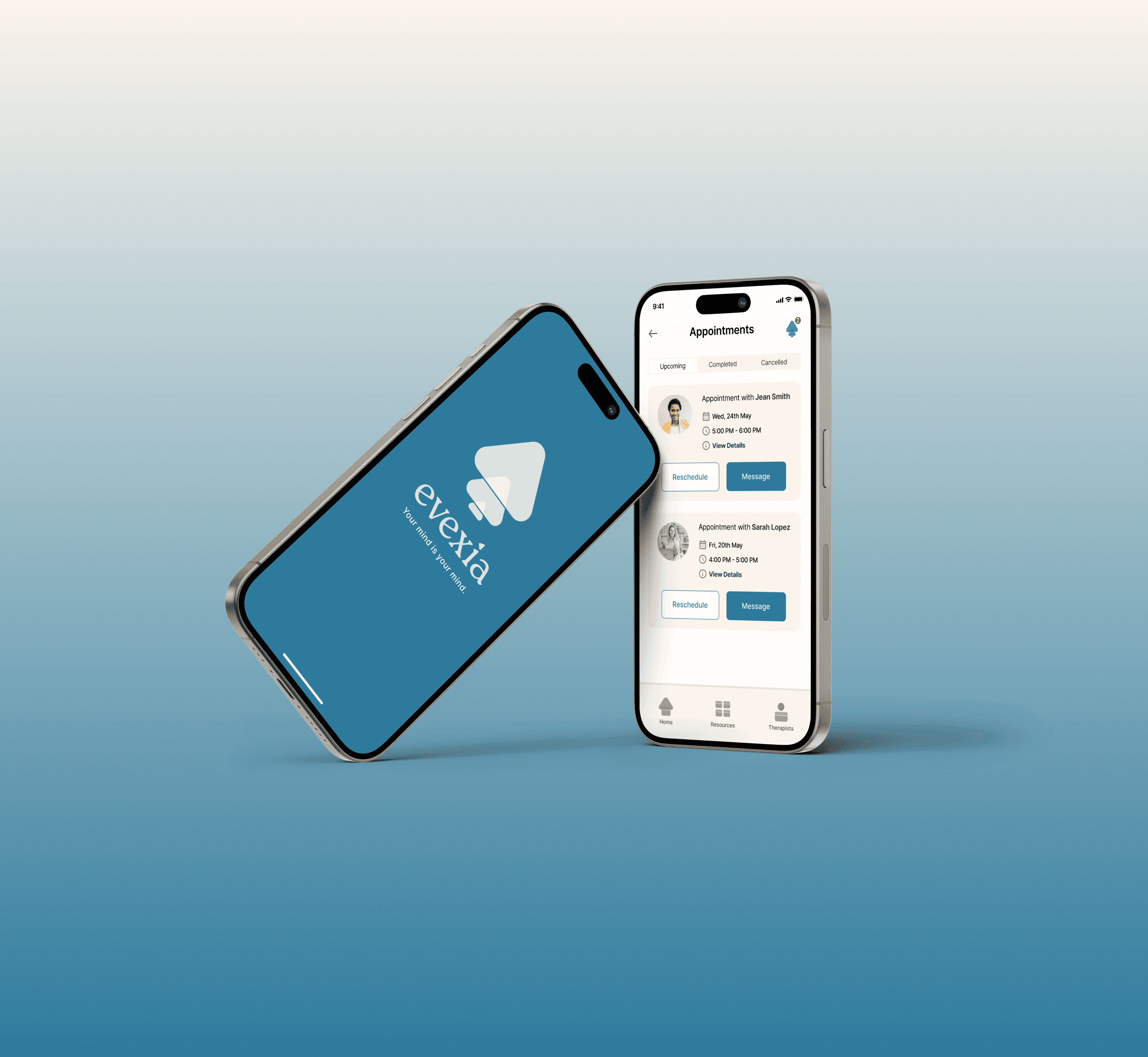
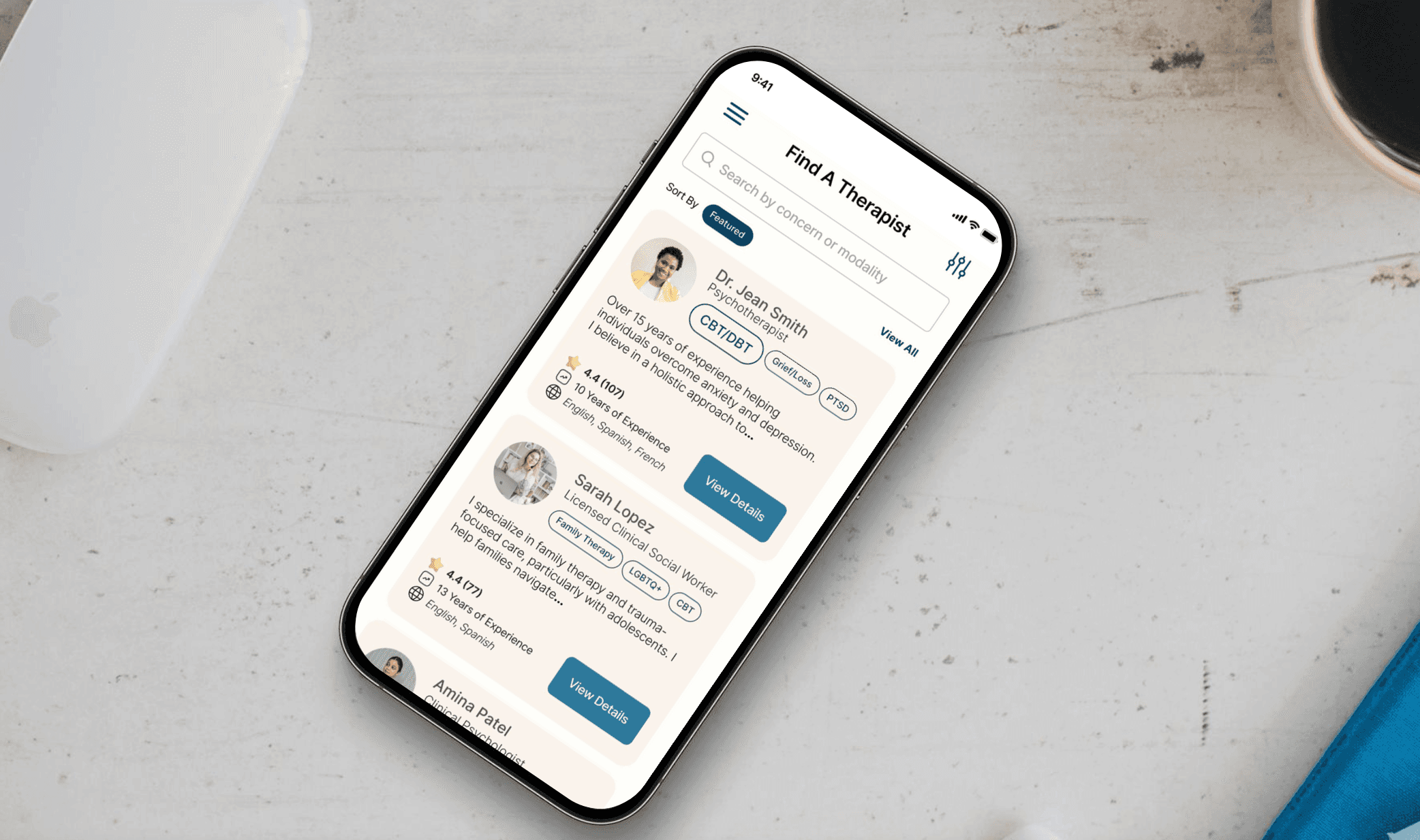

Evexia connects students with therapists—including student residents offering more affordable care. It’s built to make the early steps easier: finding someone, feeling like it’s a good fit, and booking without second-guessing. It also gives therapists a way to present themselves clearly, without needing a personal website or a clinic behind them.
Given the proprietary nature of the ongoing work at Evexia, I am unable to display the final screens of the project, specifically the therapist dashboard, publicly. If you are interested in a deeper understanding or a more detailed discussion about the project, I encourage you to schedule an appointment.
We’re still early in rollout, but we’ve defined what success looks like based on the problems we set out to solve.
These are the signals I’ll be watching closely as the product launches across pilot schools:
Are students completing the onboarding flow without dropping off?
Are therapist profiles getting viewed and booked consistently?
Are student therapists seeing enough volume to make the platform viable for them?
Are users coming back—either to book again, or to use toolkits between sessions?
Reflection
Where it got hard
Midway through, we started slipping into feature creep. New ideas kept piling on, timelines stretched, and the product started losing shape. I had to help narrow the focus—pulling us back to the core task: getting someone from “I need help” to “I have an appointment.”
Working solo meant owning every part
I was the only designer on the team. That meant research, flows, UI, testing, documentation—it all ran through me. I had to build a feedback loop with users and get comfortable making high-stakes decisions without a second set of design eyes.
What made it into the MVP
A streamlined mobile booking flow
Clear profiles for both licensed and student therapists
Simple onboarding that explains the platform without slowing users down
What we’re working on now
Adapting the experience for web
Designing a new Programs & Toolkits feature to support students with self-guided resources between sessions
What I learned
How to prioritize when everything feels important
How to let go of good ideas when they don’t fit
How to design for multiple users without overcomplicating the experience